Power BI Field Parameters — A Quick way for Dynamic Visuals
The field parameter feature is released in the May 2022 update of power bi as a preview feature. It allows users to dynamically change the dimensions or measures in a visual. This feature allows developers to create a dynamic report where end-user can change Axis/Row/Column or Measure/values in a visual/page.
For dimension/Axis slicer, it can completely replace the need for bookmarks and unpivot table columns to have a dynamic axis. This is one of the most awaited features.
For the measure slicer, it replaces the old technique of creating an independent table and then writing down a measure, where one can change the measure in the visual based on slicer selection from the newly created table. In the old technique, there was always an issue when the new measure is having measures with different formats like percent vs number.
There is one more alternative for the measure slicer, which is the calculation group. And this will still hold strong as it allows one to convert measure to dimension, which is not possible in the case of field parameter. Calculation groups still hold relevance for scenarios where one needs the measure on the top of the dimensions in the matrix column and when one needs a measure in small multiples.
Enable the Feature
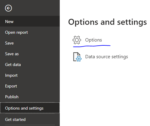
To enable this feature in Power BI Desktop. Go to File → Options and Settings → Options → Preview Features and enable Field parameters

My Model
Sales Fact joined to Customer, Geography, Item, and Date dimensions

Axis Slicer
Create Field Parameter: For Dimension Slicer. Modeling Tab → New Parameters → Small Down arrow →Fields

A pop-up will open. There I dragged from right to left. State from Geography. Brand, Sub Category, and Category from Item dimension.

Renamed it to Axis Slicer and pressed create
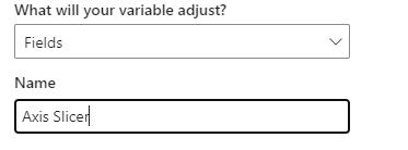
A new table is created and the slicer is added to the page automatically, as add slicer to this page was checked. If needed, you can a new slicer using the column “Axis Slicer”

Code of the Table
Axis Slicer = {
 (“State”, NAMEOF(‘Geography’[State]), 0),
 (“Brand”, NAMEOF(‘Item’[Brand]), 1),
 (“Category”, NAMEOF(‘Item’[Category]), 2),
 (“Sub Category”, NAMEOF(‘Item’[Sub Category]), 3)
}
If you manually create such a table, it might not work.
Changed slicer orientation to horizontal. And added a bar visual with “Axis Slicer” on X-axis and [net] on Y-Axis. If you select a single value in the slicer, it will not show any drill option for hierarchy on the visual.
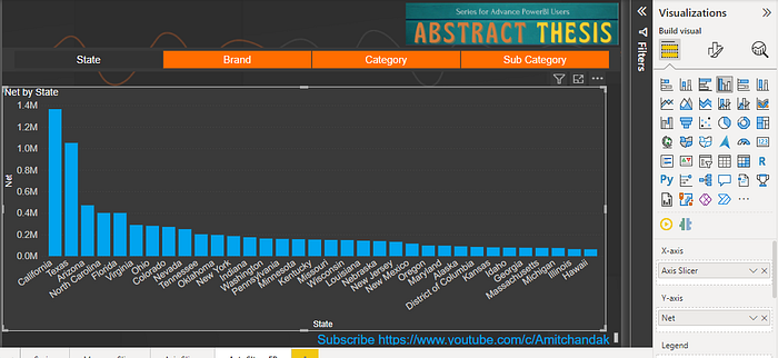
Click on Brand. It changes Axis to Brand

Uncheck all values on the slicer you will get hierarchy options like drill down, next level, and expand.

Next-> expand -> Sort of axis (State → Brand). Concatenate label off. You have to do this for each step

Selectedvalue function does not work on the column “Axis Slicer”, but worked when I used a code like
What is selected = maxx(filter(‘Axis Slicer’, ‘Axis Slicer’[Axis Slicer Order]= SELECTEDVALUE(‘Axis Slicer’[Axis Slicer Order])),’Axis Slicer’[Axis Slicer])You can change the visual as per need.
Almost Similar stuff was created using bookmarks and buttons. Three bookmarks and three buttons were created. All visuals were placed one behind other


Advantage over bookmarks
- Less number of visual
- Easy to maintain
- Visual hierarchy options are available
Measure Slicer
Create Field Parameter: For Measure Slicer. Modeling Tab → New Parameters → Small Down arrow →Fields

A pop-up will open. There I dragged from right to left: Gross, Net, Margin%, and Discount% and name the parameter as “measure slicer”.
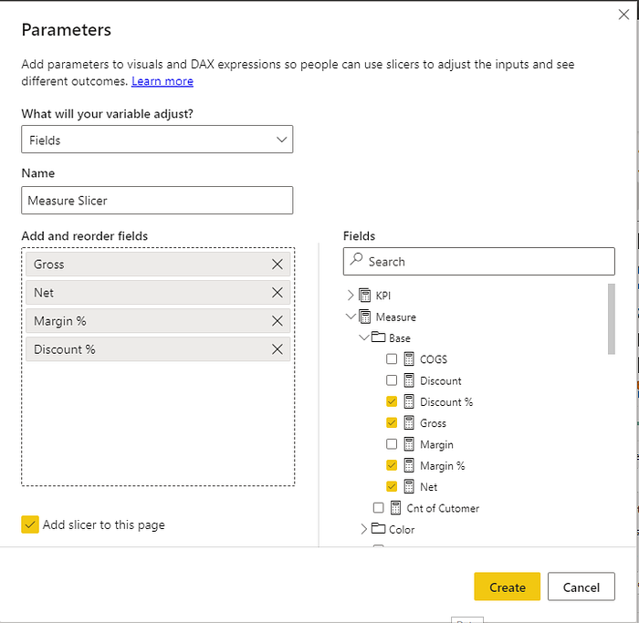
A new table is created and the slicer is added to the page automatically, as add slicer to this page was checked. If needed you can drag the column Measure Slicer and create a slicer

Code of table
Measure Slicer = {
 (“Gross”, NAMEOF(‘Measure’[Gross]), 0),
 (“Net”, NAMEOF(‘Measure’[Net]), 1),
 (“Margin %”, NAMEOF(‘Measure’[Margin %]), 2),
 (“Discount %”, NAMEOF(‘Measure’[Discount %]), 3)
}
Changed the slicer orientation to the horizontal and added a table and a bar visual. With no selection, all measures are displayed with the correct data types. On Bar used brand of x-axis and “Measure slicer” on the y-axis. In table visual used brand and “Measure slicer”

Changed Selection. You can display one or more measures as per need.

Old Method
If you want to do the same using the old measure slicer option. You can create a table using the enter data option

Create a measure using this table
Selected Measure = SWITCH(SELECTEDVALUE(‘Measure Selector’[Measure Selector],”Gross”) ,
“Gross”, [Gross],
“Net”, [Net],
“Margin %”, [Margin %],
“Discount %”, [Discount %]
)
Create a slicer using “Measure Selector” and a bar using with x-axis as Brand and “selected measure” as measure/y-axis. Added “Selected Measure” column also to the title
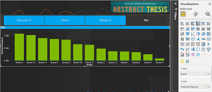
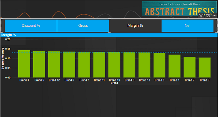
The issue occurs when you choose Margin % or discount %, with no percent formatting. Also, only the title can change.
Calculation Groups
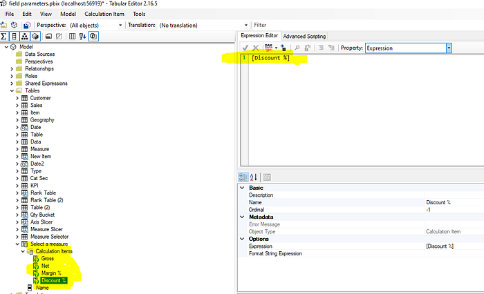
Let us try the calculation group using an external tool, Tabular Editor 2

Right-click on the table and create a new calculation group

Rename

Right click and add a new calculation item

Rename and add measure in the expression. And add other measures in the same way

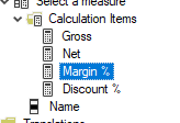
All measures are added
Choose Property: Format Sting and provide the format for Margin % and Discount %

Save the changes in the tabular editor. Option in the toolbar

No item should give an error
Refresh is needed, in the power bi desktop

You got a new table

This action has converted measure to dimension(a new table is created to facilitate that), you need at least one measure in the visual. Added slicer on the “Name” of the “Select a measure” calculation group table. Added table visual with Brand, Name, and net. You can see the format working
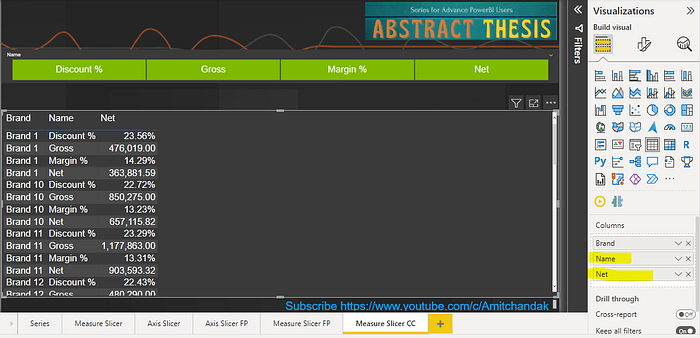
You can select one or more measures as per need. Created a bar with Name as a legend. Brand as x-axis and net as y-Axis

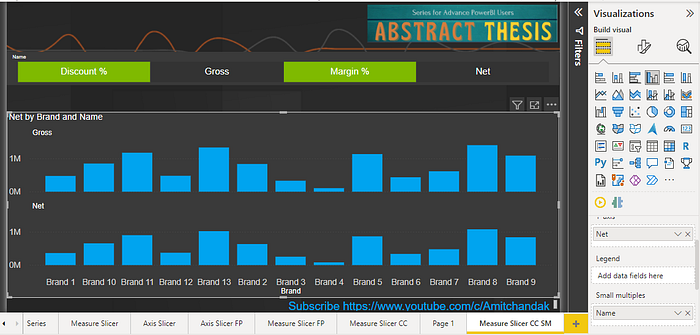
You can use a calculation group in small multiples. But you can not use field parameter
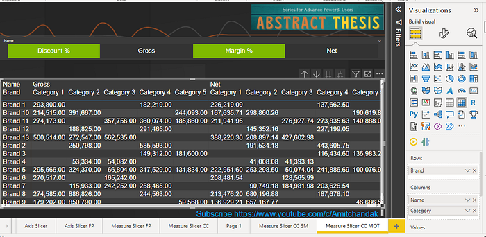
A calculation group also helps in fulfilling the requirement of measures on top of a matrix column.
With field parameter, you can not
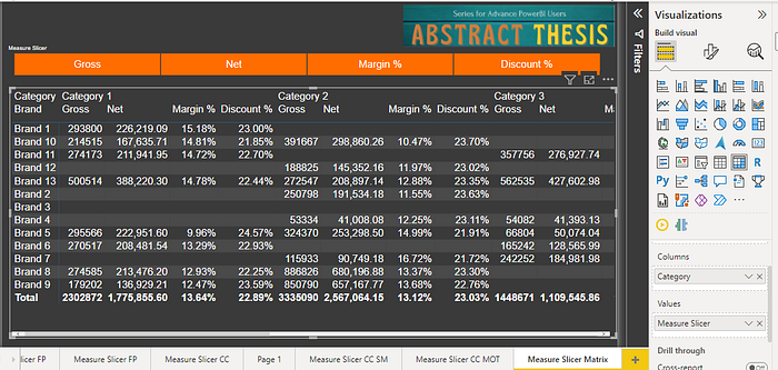
The conclusion is that in case you need the measure to a dimension conversion you still need a calculation group. In other cases, the field parameter is the best option for the measure slicer.
Let us use dimension as well as the measure in the slicers, created using field parameters. A combined visual.
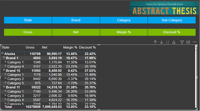
You can find the file here. Please like and comment.
Video for detailed steps
Want to Learn More, Explore these videos and video series.
Complete Power BI Tutorial/Course in Just 11 Hours
Mastering Microsoft Fabric: 30 Videos
Want to Learn SQL: 20 Videos
Mastering Power BI: 230+ Videos
Power BI Concepts- How Power BI Works- 150+ Videos
Migrating from Tableau to Power BI: 30 Videos
DAX for SQL Users: 10 Videos
What works in Power BI Direct Query- 10+ Videos
सीखे Power BI हिंदी में- 60+ Videos
Power BI Hindi On Demand- 10+ Videos
Click Here to access all my blogs and videos in a jiffy via an exclusive visual glossary using Power BI.
Please like, share, and comment on these. Your suggestions on improvement, challenges, and new topics will help me explore more.
You Can watch my Power BI Tutorial Series on My Channel, Subscribe, Like, and share
