Top 100+ Power BI Interview Questions- Part 2

Welcome back to the Power BI interview series! In Part 1, we covered the 40 Power BI Interview Questions. Today, we’re here to further enhance your understanding and assist you in preparing for additional Power BI interview questions. You can find the previous blog here for the first 40 questions.
In the dynamic world of technology, interviewing for the right candidate involves exploring multifaceted qualities. Beyond evaluating communication skills and cultural alignment, we delve deep into the bedrock of technical proficiency.
As interviewers, our quest for exceptional candidates is relentless. We seek individuals with not just a passion for data analytics, but a solid foundation in technological know-how. In this competitive landscape, it’s essential to equip yourself comprehensively. I strongly recommend immersing yourself in the vast knowledge reservoirs available. Take the time to explore the extensive 11-hour video and delve into the nuances of Power BI through the Basic and Advanced tutorials.
But that’s not all. The learning curve in Power BI is ever-evolving. To stay ahead of the game, I encourage you to explore materials from Power BI Influencers and follow the top Power BI channels and blogs. These resources are invaluable, providing insights into the latest trends, updates, and best practices within the Power BI ecosystem.
Knowledge is your most powerful asset in this competitive field, and in the questions that follow, we will arm you with the insights you need to shine in your Power BI interviews. So, let’s dive in and harness the power of knowledge together.
At the end of this blog, you’ll find links to the recommended video series and influential Power BI sources. Prepare to elevate your Power BI expertise and set yourself on the path to interview success!
In Power BI interviews, it is important to show your technical skills and deep understanding of the product. This blog introduces questions that can be used to test your expertise and knowledge. These questions can also be adapted into case studies to assess your problem-solving skills.
I’ve created a PBIX file with sample Power BI questions, code examples, and solutions to help you learn how to use Power BI. You can find the source files on my Git repository and the PBIX file on the Power BI community.
I’m still in the early stages of production on the new videos for 61 questions for part 2 of Power BI Interview Questions. However, I’ll post an update on my blog once they’re available. Whenever possible, I provide related videos from my channel. I’m hoping these videos will help anyone who is preparing for a Power BI interview. I’m also hoping they will help anyone who simply wants to learn more about the latest Power BI features and functionality.
I have uploaded the videos for the previous 40 questions to my YouTube channel and updated their link to the last blog post.
Question 41-What is the difference between RELATED and RELATEDTABLE?
In Power BI /DAX, both RELATED and RELATEDTABLE are functions used to work with related tables in a data model. There are, however, some differences between the two.
- RELATED Function (RELATED):
A RELATED function retrieves a single value from a related table that is on the “one” side of a one-to-many relationship. It is typically used in a calculated column or measure when you want to fetch a specific column value from a related table for the current row based on the relationship defined in your data model.
For example, we have a relationship between a “Sales” table and an “Item”(1-M, Item on one side) table, where each sale is related to a specific Item, we can use RELATED to fetch an Item attribute (e.g., Brand) from the “Item” table for each sale row.
Brand = RELATED(Item[Brand])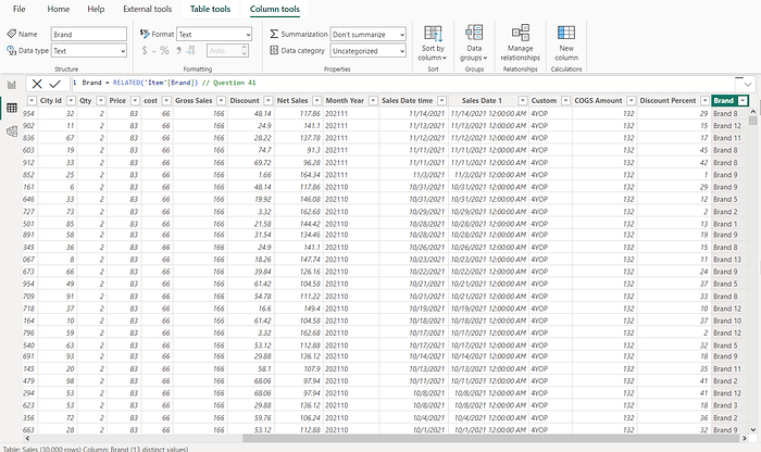
2. RELATEDTABLE Function:
A RELATEDTABLE function retrieves an entire table from any related side of a relationship. In this case, it returns a table containing all of the related rows in it. It is useful when you want to perform further operations on the related table as a whole, such as filtering, summarizing, or counting related records, by using this function.
- For instance, if we want to calculate the total sales amount for each item and we have a relationship between “Sales” and “Item”(1-M, Item on one side), we can use RELATEDTABLE to create a table of related sales and then perform aggregation on it.
A new column in the Item Table
Item Sales = SUMX( RELATEDTABLE(Sales), Sales[Gross Amount] )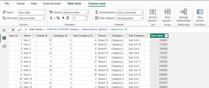
Example of a new column in a “Many to Many” relationship
All Items = CONCATENATEX(RELATEDTABLE('Item'), 'Item'[Name], ", ")In summary, RELATED retrieves a single value from a related table that too from “one side” in a “One to Many” Relationship, while RELATEDTABLE retrieves a table of related rows. Your choice between these functions depends on the specific requirements of your calculations and what you need to achieve with your DAX formulas in Power BI.
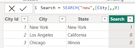
Question 42: What is the difference between search and find?
In Power BI/DAX, both the SEARCH and FIND functions are used to search for a substring within a text string and return the position of the first occurrence of that substring. There is, however, a difference between their behavior:
SEARCH Function:
- It is important to remember that SEARCH is case-insensitive, which means it does not take into account whether the characters in the text or the search substring are in uppercase or lowercase.
- It returns the position of the first occurrence of the search substring within the text, starting from 1 as the first character’s position.
- Search supports wildcards
Example:
Position = SEARCH("new", "New York") // Returns 1
Example: with not found value and table column
Example: with wildcard

FIND Function:
- FIND is case-sensitive and considers the character’s “case” when searching.
- It returns the position of the first occurrence of the search substring within the text, starting from 1 as the first character’s position.
- If the search substring is not found within the text, FIND returns an error.
- FIND does not support wildcards
Example:
Position = FIND("new", "New York") // Returns #ERROR!
Position = FIND("new", "New York",,0) //Returns 0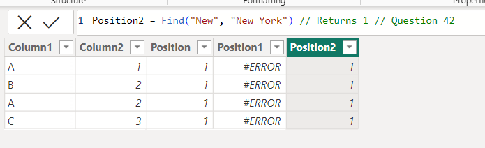
So, the key difference between the two functions is case sensitivity and wildcard support. If you need a case-insensitive search, you would typically use SEARCH, whereas if you need a case-sensitive search, you would use FIND.
43: What does FIRSTNONBLANKVALUE function do?
In Power BI/DAX, the FIRSTNONBLANKVALUE function is used to return the first value that is not blank when evaluating an expression for a column. Any valid DAX expression can be used as the expression. The column can be any column(sorted values) in the current table or one that is referenced by a relationship in the current table.
The syntax of the FIRSTNONBLANKVALUE function is:
FIRSTNONBLANKVALUE(<column>, <expression>)
The first non-blank value of <expression>, as determined by the column sorted values.
where:
The FIRSTNONBLANKVALUE function returns a single value of any type. The type of the returned value is the same as the expression type.
Here is an example of using the FIRSTNONBLANKVALUE function, a new measure:
FIRST NON BLANK VALUE = FIRSTNONBLANKVALUE(FNBValue[Date], SUM(FNBValue[Qty]))
This function returns the first non-blank value of the Date column, evaluated for each value of the Qty column.
This function is especially useful for finding the Opening Balance. Or the first value in a period.
In the same way, you can be asked about LASTNONBLANKVALUE
Question 44: Give examples of Power BI/DAX functions that are very similar to SQL window functions.
The DAX functions Offset, Window, and Index are similar to SQL window functions in that they perform a calculation across a set of table rows that are related to the current row. These functions are not quite like SQL window functions because they rely on something called the DAX evaluation context to figure out the “current row”. The DAX functions do not return a value, but rather a set of rows. This set of rows can then be used with other DAX functions, such as CALCULATE or SUMX, to calculate a value.
The INDEX function retrieves a row using its absolute position in the table.
//Topper
Index = Index(1,ALLSELECTED('Item'[Brand]),ORDERBY([Net],DESC))
Index Value = CALCULATE([Net], Index(1,ALLSELECTED('Item'[Brand]),ORDERBY([Net],DESC)))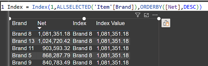
The OFFSET function retrieves a row using its relative position to the current row.
//Last Row Value(Net), based on net for Item brand
offset = CALCULATE( [Net], OFFSET(-1,ALLSELECTED('Item'[Brand]),ORDERBY([Net],DESC))) //Last Row Value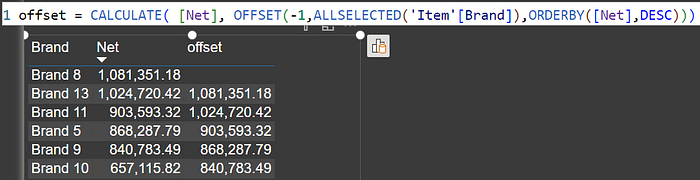
The WINDOW function retrieves a slice of rows that are filtered or sorted in a specific way.
Running Total = CALCULATE([Net], WINDOW(0,ABS,0, REL, ALLSELECTED('Date'[Date]),ORDERBY('Date'[Date],ASC))) 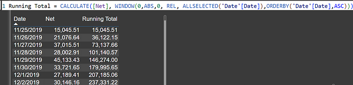
RANK and ROWNUMBER are two new DAX functions added in April 2023, that work like window functions. Both functions return the ranking of the current row within a specified partition, sorted by a specified order. The difference between the two functions is how they handle ties (i.e., when two rows have the same value for the ranking column).
RANK returns the same rank to all tied rows. For example, if there are two rows with the same highest sales value, RANK will assign rank 1 to both rows.
ROWNUMBER, on the other hand, returns a unique ranking to each row, even if there are ties. If there are two rows with the same highest sales value, ROWNUMBER will assign the rank 1 to the first row and the rank 2 to the second row.
ROWNUMBER will return an error if it is unable to uniquely identify every row in the partition. However, ROWNUMBER will try to avoid returning an error by finding the least number of additional columns required to uniquely identify every row and appending these new columns to the ORDER BY clause.
Here are some examples of RANK and ROWNUMBER use:
RANK(Sales, ALLSELECTED(Products), ORDER BY(Products[Sales]))
ROWNUMBER(ALLSELECTED(Customers), ORDER BY(Customers[TotalOrders]))
Question 45: What are the differences between DAX functions Rank and Rankx?
There is a notable distinction between RANK and RANKX. You cannot just treat them like SUM and SUMX.
RANK is similar to window functions and employs concepts such as relation, ordering, and partitioning, similar to functions like WINDOW, OFFSET, and INDEX. It was released in April 2023. It is particularly well-suited for measures.
RANKX is the old function in Power BI and can be effectively used with both columns and measures, making it a more versatile choice.
RANKX: This function computes the rank of a value among all possible values derived from the evaluation of an expression across all rows of a table. It provides a rank number based on the evaluation of the expression for each row in the table. The default sort order is descending.
RANK: In contrast, the RANK function returns the ranking for the current context within the specified partition, sorted by the specified order. If there is no match found, the rank is returned as blank. The default sort order is ascending.
When used in a measure, the RANKX function can not use a column to provide rank in the order by expression, while RANK can.
RANK is a better choice to resolve ties and order of blanks compared to RANKX.
While RANK is not a replacement for the RANKX function, it is the preferred choice going forward.
Rank 1 = RANKX(ALLSELECTED(Sales[Order No]), [Net],,,Dense) //Default desc
Rank 2 = RANK(DENSE,ALLSELECTED(Sales[Order No]),ORDERBY([Net])) //Default asc
Rank 4 = RANK(DENSE,ALLSELECTED(Sales[Order No]),ORDERBY([Net],DESC))
// Rank can use column in Measure to order by
Rank 3 = RANK(DENSE,ALLSELECTED(Sales[Order No]),ORDERBY([Order No]))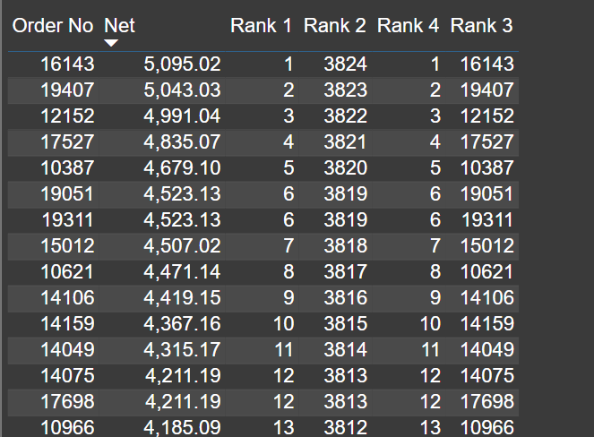
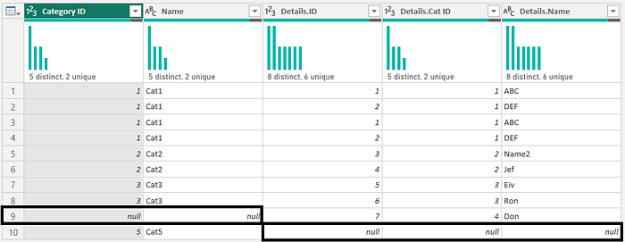
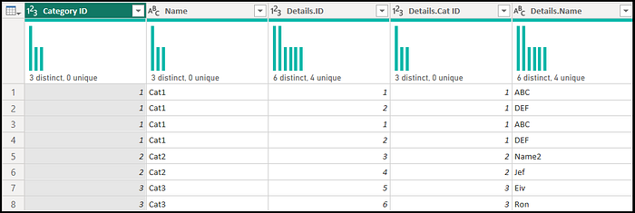
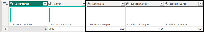
Question 46: What is the difference between GENERATE and CROSSJOIN
GENERATE Function:
GENERATE returns a table that combines each row from table1 with the result of evaluating table2 in the context of the current row from table1.
If the evaluation of Table 2 for a specific row in table 1 results in an empty table, that row from Table 1 is excluded from the result.
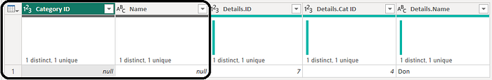
NewTable = GENERATE(Regions, Categories)CROSSJOIN Function:
CROSSJOIN returns a table that contains the Cartesian product of all rows from all tables provided as arguments.
The resulting table includes all the columns from all the argument tables.
AllCombinations = CROSSJOIN(Regions, Categories)When to Use GENERATE vs. CROSSJOIN:
Use GENERATE when you want to apply filters or evaluate expressions for each row in an existing table. For instance, generating dates between a start and end date for each row is more efficiently done with GENERATE.
Gen Table = GENERATE(Employee, CALENDAR([Start Date], [End Date]))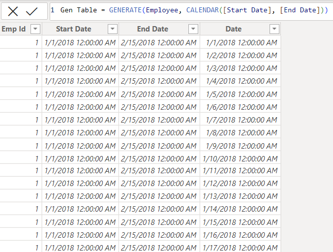
Use CROSSJOIN when you want to create a table that shows all possible combinations of values from two or more tables, without applying any specific filters or expressions.
In the Case below Cross join is not a good choice:
Cross Table= filter(CROSSJOIN(Employee, CALENDAR(Min(Employee[Start Date]), Max(Employee[End Date]))), [Date] >= [Start Date] && [Date] <= [End Date])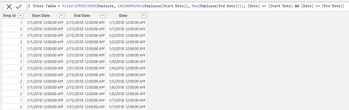
In summary, GENERATE is preferable when you need to apply filters or expressions, while CROSSJOIN is suitable for generating tables that represent all possible combinations of values from multiple tables, without additional filtering or evaluation.
Refer the video.
Question 47: What is the difference between the CALENDAR and CALENDARAUTO
The main difference between the CALENDAR and CALENDARAUTO DAX functions in Power BI is that
CALENDARAUTO scans the entire model automatically and returns a date table with all of the dates that are present in the model
CALENDAR, on the other hand, requires you to specify the start and end dates for the date table.
If you want to create a date table containing a specific range of dates, you can use CALENDAR. Using CALENDAR, you could create a date table that contains all of the dates between January 1, 2019 and October 31, 2022.
CALENDAR(date(2019,01,01), date(2022,10,31)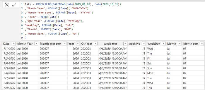
CALENDARAUTO can be useful if you want to create a date table that contains all of the dates that are present in your model.
CalendarAUTO()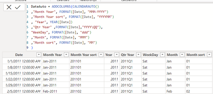
The CALENDARAUTO function may lead to a circular dependency issue when you create relationships in your model, especially when two or more related tables have date columns or when you’re using a calculated table.
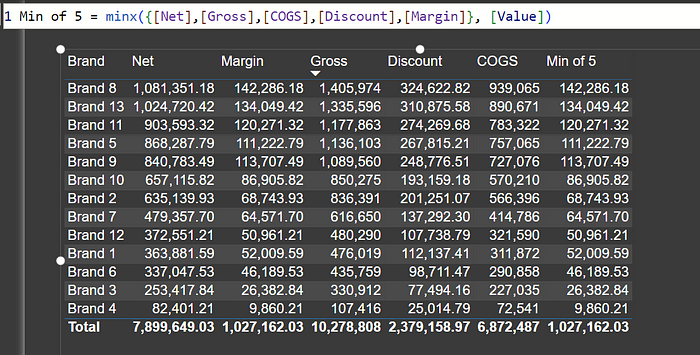
Question 48: What is the best way to find min values 5 columns or measures for a given table row or visual row?
If you only need to find the minimum value between two columns or measures, you can use the MIN function directly:
Min([Col1], [Col2])
or
Min([Measure1], [Measure2])
However, when you want to find the minimum value among more than two columns or measures, you can use the MINX function in combination with a DAX table created in the expression part.
In the expression part of your Power BI MINX function, you can create a DAX table using curly braces {}. Inside the table, list the columns or measures from which you want the minimum value.
For example, to find the minimum value among three columns (Col1, Col2, Col3), you would create a DAX table expression like this:{ [Col1], [Col2], [Col3] }
You can use the MINX function to find the minimum value among the elements of that table. Specify the table as the first argument and the column or measure to evaluate as the second argument.
MinValue = MINX({ [Col1], [Col2], [Col3], [Col4] , [Col5] }, [Value])
Or
Min of Five Measure
= VAR temp = { [Measure1], [Measure2], [Measure3], [Measure4], [Measure5] }
RETURN MINX( temp, [Value] )
Question 49: How can we repeat the value of a measure or column?
With Power BI, it is possible to repeat the value of a measure or column within a measure or column by using the REPT function. This function is designed to duplicate text a specified number of times, allowing you to populate a cell with multiple instances of a text string.
The REPT function is structured as follows:
REPT(<text>, <num_times>)
Here’s a breakdown of its components:
- <text> represents the text you intend to repeat.
- <num_times> is a positive numerical value indicating how many times you wish to repeat the specified text.
When num_times=”0", REPT returns an empty cell. Moreover, if <num_times> isn’t an integer, it will be rounded down to the nearest whole number. It’s essential to note that the result of the REPT function cannot exceed 32,767 characters; exceeding this limit will trigger an error.
Example
REPT 5 = REPT("A", 5)You can also use CONCATENATEX and GENERATESERIES combination
Example
Concat 5 = CONCATENATEX(GENERATESERIES(1,5), "A",", ")Where:
- GENERATESERIES(1, 5) generates a series of numbers from 1 to 5.
- “A” is the text you want to repeat.
- “, “ is the delimiter that you want to use between the repeated values in order to separate them.
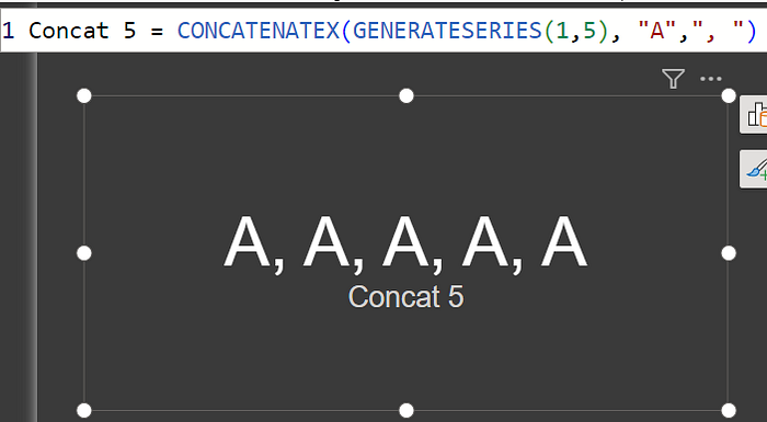
This formula concatenates the text “A” five times with commas and spaces between repetitions. Replace “A” with any text or column name you want to repeat.
Question 50: How can we generate a series of odd numbers or even numbers?
In Power BI, you can use DAX’s GENERATESERIES function to generate a series of odd or even numbers.
To generate a series of odd numbers, you can use the following DAX expression:
ODD_SERIES = GENERATESERIES(1, 10, 2)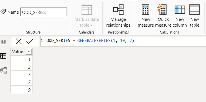
Using this expression, you can generate odd numbers from 1 to 10 with an increment of 2. Depending on your needs, you can adjust the start and end values.
To generate a series of even numbers, you can use the following DAX expression:
EVEN_SERIES = GENERATESERIES(2, 10, 2)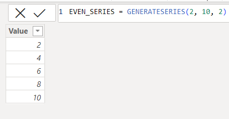
An expression like this generates a series of even numbers from 2 to 10 with an increment of 2. If necessary, you can modify the start and end values.
These expressions will create calculated tables in Power BI that contain the desired series of odd or even numbers.
The List.Numbers function in Power Query can be used to generate lists of numbers.
In Power Query, create a new query.
The formula you can use is as follows:
= List.Numbers(1, 5, 2)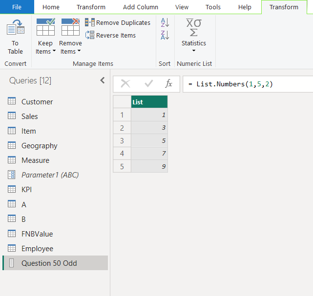
This formula generates a list of odd numbers from 1 to 9 with an increment of 2.
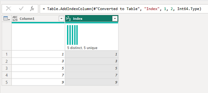
Use Table.FromList to convert the list into a table.
Table.AddIndexColumn is used to add index columns to existing tables in Power Query. Add a new step to the Advance Editor
For odd numbers:
Table.AddIndexColumn(
#"Last Step Table Name",
"Index",
1,
2
)
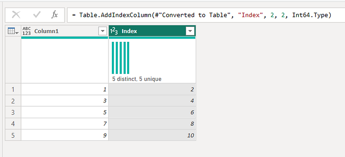
even numbers:
Table.AddIndexColumn(
#"Last Step Table Name",
"Index",
2,
2
)
Question 51: Provide a measure that gives the Running/cumulative total using the date table.
The Sales table is connected to the Date table based on the date column, with the Date table designated as the primary date table(Marked as Date Table). The Sales table features a measure called Net =(SUM(Sales[Net Sales])). Provide cumulative for Net.
To create a measure that calculates the cumulative total of Net Sales in Power BI, considering the Date table as the primary date table and using either window functions or filter functions, you can follow these steps.
Measure 1: Cumulative Sales using Filter Function (All Dates)
This measure calculates the cumulative sales considering all dates, even those not in the current context. It uses the CALCULATE function in combination with the FILTER and ALL functions to achieve this.
Cumm Sales = CALCULATE([Net], FILTER(ALL('Date')
, 'Date'[Date] <= MAX('Date'[Date])))
CALCULATE([Net], …) calculates the Net Sales.
FILTER(ALL(‘Date’), ‘Date’[Date] <= MAX(‘Date’[Date])) filters the Date table to include all dates, where the date is less than or equal to the maximum date (MAX(‘Date’[Date])) in the context.
Measure 2: Cumulative Sales using Filter Function (Selected Dates)
This measure calculates the cumulative sales considering only the selected dates. It uses the CALCULATE function in combination with the FILTER and ALLSELECTED functions.
Cumm Sales sel = CALCULATE([Net], FILTER(ALLSELECTED('Date'),
    'Date'[Date] <= MAX('Date'[Date])))
CALCULATE([Net], …) calculates the Net Sales.
FILTER(ALLSELECTED(‘Date’[Date]), …) filters the Date table to include only the selected dates (ALLSELECTED(‘Date’[Date])) where the date is less than or equal to the maximum date (MAX(‘Date’[Date])) in the Date table.
Measure 3: Cumulative Sales using Window Function (All Dates)
This measure calculates the cumulative sales using a window function, considering all dates. It uses the CALCULATE function with the Window function.
Cumm Based on Date = CALCULATE([Net],
 Window(
 1, // Start of the window Position
 ABS, // Start of the window: Absolute
 0, //End of the window Position
 REL, // End of the window: Relative
 ALL('Date'), // All dates from the Date table
 ORDERBY('Date'[Date], ASC) // Sort the dates in ascending order
 )
)
CALCULATE([Net], …) calculates the Net Sales.
Window(…) defines the window function, Which uses from absolute 1 position to 0 of relative position over all the date of date table order by in ascending order.
Measure 4: Cumulative Sales using Window Function (Selected Dates)
This measure calculates the cumulative sales using a window function, considering only the selected dates. It uses the CALCULATE function with the Window function and ALLSELECTED to consider the selected dates.
Cumm Based on Date sel = CALCULATE([Net],
 Window(
 0, // Start of the window Position
 ABS, // Start of the window: Absolute
 0, //End of the window Position
 REL, // End of the window: Relative
 ALLSELECTED('Date'), // All dates from the Date table
 ORDERBY('Date'[Date], ASC) // Sort the dates in ascending order
 )
)
CALCULATE([Net], …) calculates the Net Sales.
Window(…) defines the window function, Which uses from absolute 1 position to 0 of relative position over allselected the date of date table order by in ascending order.
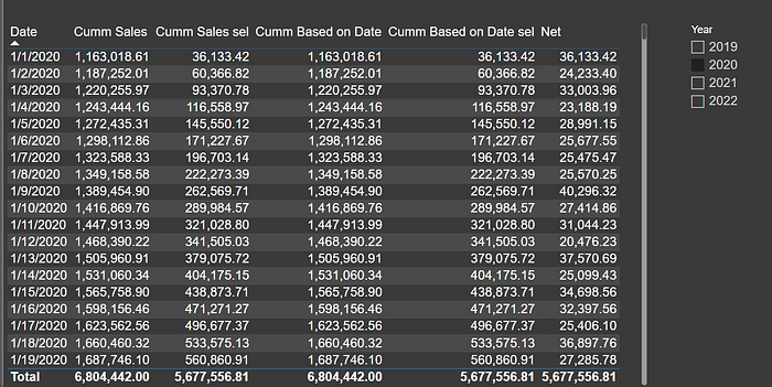
These measures allow you to calculate cumulative sales or running total in Power BI based on your specific requirements, either considering all dates or only selected dates, using filter functions or window functions.
Question 52: How to get Top/bottom performer?
Power BI has several options to identify the top or bottom performers in your data. These options include RankX, Rank, and TOPN. However, it’s worthwhile to note that both RankX and Rank may require an additional filter, either at the visual level or within a measure. On the other hand, TOPN provides an easy way to retrieve filtered data.
Example
Top 1 = CALCULATE([Gross], KEEPFILTERS(TOPN(1,ALLSELECTED('Item'[Brand]),
[Gross],DESC)))

Bottom 1= CALCULATE([Gross], KEEPFILTERS(TOPN(1,ALLSELECTED('Item'[Brand]),
[Gross],ASC)))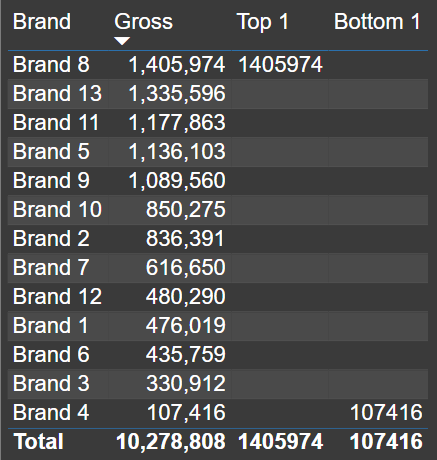
TOPN is not the best option when you want to use the second top or the second from the bottom. It can give you top/bottom 2 easily
Top 2 = CALCULATE([Gross], KEEPFILTERS(TOPN(2,ALLSELECTED('Item'[Brand])
, [Gross],DESC)))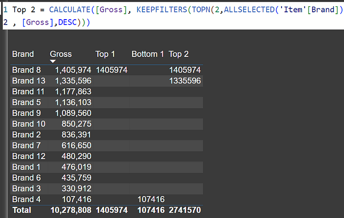
However, the most versatile of these methods is the Index function, released in December 2022. Unlike the others, the Index function allows you to identify not only the top performer but also the second, third, and so on. This is without an additional filter or measure.
Here are some examples
To get the TOP performer:
TOP = CALCULATE([Gross], KEEPFILTERS(INDEX(1, ALLSELECTED('Item'[Brand]),
ORDERBY([Gross], DESC))))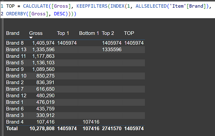
To get the BOTTOM performer:
Bottom = CALCULATE([Gross], KEEPFILTERS(INDEX(1, ALLSELECTED('Item'[Brand]),
ORDERBY([Gross], ASC))))
To get the SECOND TOP performer:
TOP 2nd = CALCULATE([Gross], KEEPFILTERS(INDEX(2, ALLSELECTED('Item'[Brand]),
ORDERBY([Gross], DESC))))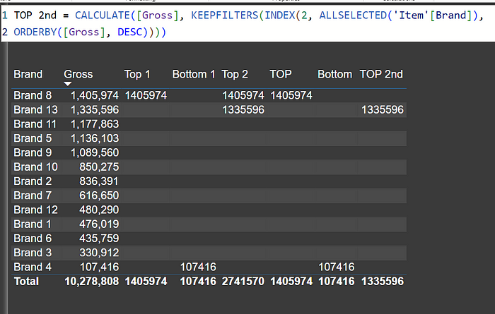
Using the Index function in this way provides a flexible and powerful way to analyze your data without the need for complex additional filters or measures.
Question 53: How to add a unique sequence number field in Power BI visual?
Although Power BI does not offer a built-in solution for this, the new row number function can be used to accomplish it.
an example
Seq No = ROWNUMBER(ALLSELECTED('Item'[Brand], 'Item'[Category]),ORDERBY([Net],DESC),LAST)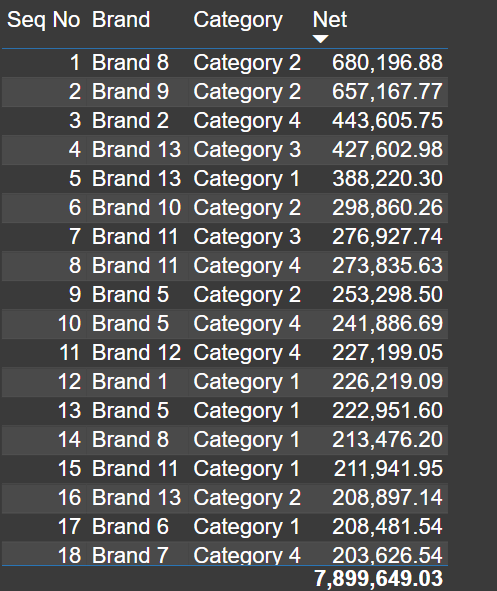
Question 54: How to append two tables in DAX
In DAX, the UNION function can be used to append data. Combining two tables into one makes it easier to analyze data using the UNION function. By taking two tables as input, it returns a new table containing all the rows from both tables. There must be the same number of columns in both tables. A return table will contain the same columns as the table in the Table 1 expression. The columns in the respective tables are combined based on their positions. The duplicate rows are retained, which means it is a union all
Suppose you want to append two tables, Table1 and Table2, together. To accomplish this, you could use the following DAX code:
AppendedTable = UNION(Table1, Table2)The AppendedTable code will create a new table that contains all the rows from both Table 1 and Table 2.
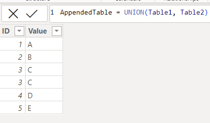
Note: The new table does not carry forward the relationship of the previous table. You have to create new relationships
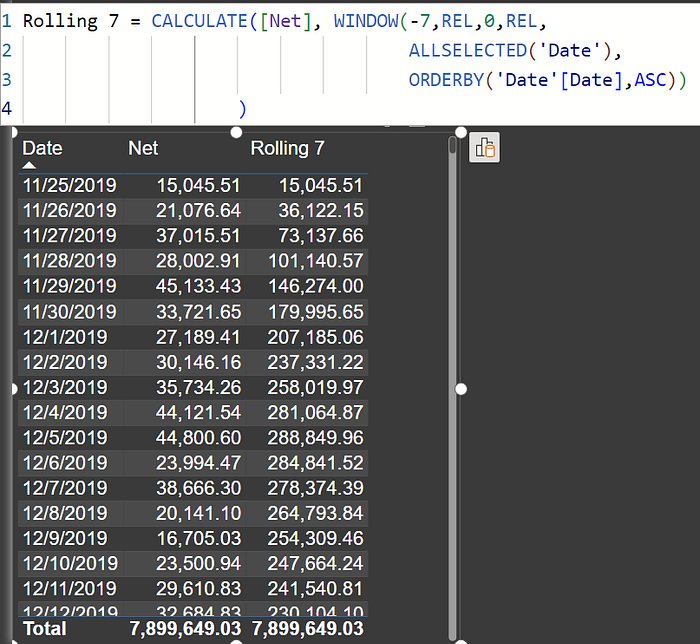
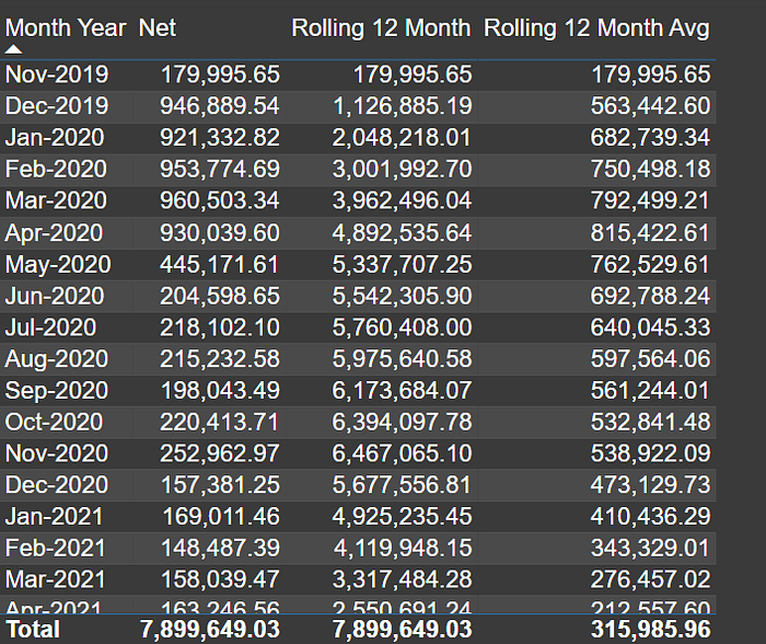
Question 55: Give some examples of measures we can create using the Window Function.
How to create a rolling 12 months average?
Window functions can be used to create measures for running totals, rolling totals, month-to-date, quarter-to-date, year-to-date, and averages, window functions can be used for many other functions as well
Example: Rolling 30 measure
Rolling 7 = CALCULATE([Net], WINDOW(-7,REL,0,REL,
                                    ALLSELECTED('Date'),
                                    ORDERBY('Date'[Date],ASC))
                    )
Month-year text cannot be sorted, so we need to use a sort column in the formula to create a rolling month-measure
Rolling 12 Month
Rolling 12 Month = CALCULATE([Net], WINDOW(-11,REL,0,REL,
                                    ALLSELECTED('Date'[Month Year sort], 'Date'[Month Year]),
                                    ORDERBY('Date'[Month Year sort]))
                    )
Average of Rolling 12 months
Rolling 12 Month Avg = CALCULATE(AVERAGEX(Values('Date'[Month Year]),[Net]), WINDOW(-11,REL,0,REL,
                                    ALLSELECTED('Date'[Month Year sort], 'Date'[Month Year]),
                                    ORDERBY('Date'[Month Year sort]))
                    )
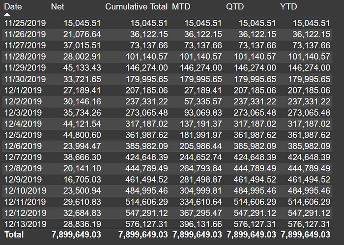
For running total/cumulative we have to start from the 0/1 abs(absolute/fixed) position. In this, I am building the formula using date. By using date I Can solve cumulative on all the above levels like week, month, quarter, and year.
Date Wise running total
Cumulative Total = CALCULATE([Net], WINDOW(1,ABS,0,REL,
                                    ALLSELECTED('Date'),
                                    ORDERBY('Date'[Date]))
                    )
Now, if we control this cumulative formula using partitions, we can get MTD, QTD, and YTD
MTD = CALCULATE([Net], WINDOW(1,ABS,0,REL,
                                    ALLSELECTED('Date'),
                                    ORDERBY('Date'[Date]),,PARTITIONBY('Date'[Month Year])
                    ))

QTD = CALCULATE([Net], WINDOW(1,ABS,0,REL,
                                    ALLSELECTED('Date'),
                                    ORDERBY('Date'[Date]),,PARTITIONBY('Date'[Qtr Year])
                    ))

YTD = CALCULATE([Net], WINDOW(1,ABS,0,REL,
                                    ALLSELECTED('Date'),
                                    ORDERBY('Date'[Date]),,PARTITIONBY('Date'[Year])
                    ))
Question 56: I am not able to create “one to many join” in Power BI. It shows an issue with my dimension table, tell me how can I identify that have a duplicate in my dimension/one-side table.
or
Way to check duplicates in the table?
To identify duplicates in a table, use a table visual on the key/join column. And add the column as “Don’t Summarize” and as Count. Put a visual level filter count >1. If you get any row means you have duplicate.
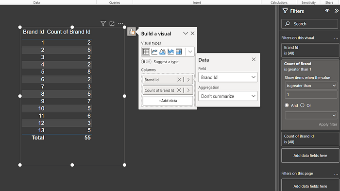
You can remove duplicates in the Power query.
Home Tab -> Remove Rows -> Duplicate Rows
Question 57: What are the four types of relationships that can be created between tables in a Power BI model?
or
- What are the different types of joins that Power BI supports?
- How can I create different types of relationships between tables in a Power BI model?
- What are some examples of how different types of relationships can be used in Power BI models?
There are different types of relationships in the Power BI model join, based on their cardinality and crossfilter direction. Cardinality can be defined as the number of unique values that participate in a relationship in every column. The cross-filter direction describes how filters are propagated between tables.
Power BI allows you to join models with four different types of relationships:
- One-to-one: This type of relationship occurs when every row in one table corresponds to exactly one row in another table. For example, a customer table might have a one-to-one relationship with a shipping address table.
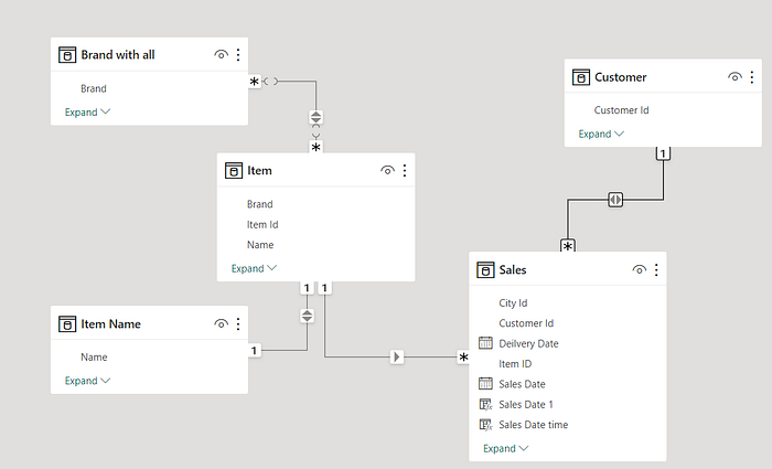
- One-to-many: One common type of relationship between tables is when each row in one table can be associated with multiple rows in another table. An illustrative case is the one-to-many relationship between an Item table and a Sales table.
- Many-to-one: This type of relationship is the opposite of a one-to-many relationship. It occurs when a row in one table is associated with multiple rows in another table. For example, a Sales table might have a many-to-one relationship with a customer table.
- Many-to-many: This type of relationship occurs when multiple rows in one table are associated with multiple rows in another table. The relationship between a customer table and an Item table might be many-to-many if a customer can buy multiple Items, and an Item can be bought by several customers.
Additionally, Power BI supports bidirectional relationships. In other words, you can create a relationship between two tables and then use that relationship to filter data in either table. For example, you could create a bidirectional relationship between a customer table and a sales table. It would be possible to filter the customer table to show only customers who have placed orders, or to filter the sales table to show only orders placed by a specific customer.
You should consider the structure of your data and the types of analysis you wish to perform when deciding what type of relationship to create between two tables. By creating the right relationships between your tables, you can make your Power BI reports and dashboards more informative and easier to use.
Question 58: What is SCD?
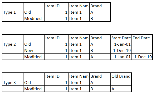
SCD stands for “Slowly Changing Dimension”. “Slowly Changing Dimensions” is a concept in data warehousing and database management that describes how dimensions or attributes in a data warehouse change over time. SCDs are particularly useful for dealing with historical data or data that evolves slowly over time, such as customer information, product details, or geographic information. An important goal of managing slowly changing dimensions in a data warehouse is to ensure historical accuracy and integrity.
SCDs are used to track these changes over time so that you can accurately analyze your data. There are three main types of SCDs:
- Type 1 SCD: This type of SCD overwrites the old value with the new value. It is the most basic type of SCD, but it can lead to data loss if historical values must be tracked.
- Type 2 SCD: This type of SCD creates a new record for each change to the dimension. In this way, you can keep track of historic values, but if the dimension changes frequently, it can lead to data bloat.
- Type 3 SCD: This type of SCD adds a new column to the dimension table to store the previous value of the changed attribute. This allows you to track the historical values of the dimension without data bloat.
Based on your particular needs and the requirements of your data warehouse, you will select a type of SCD.
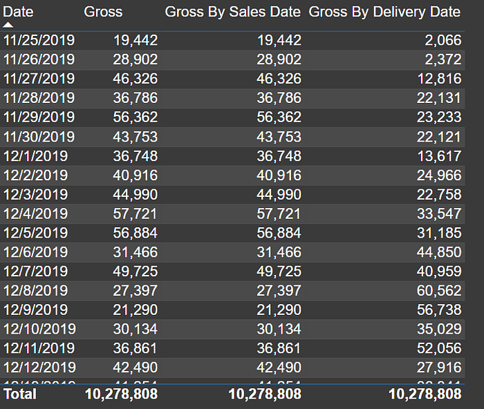
Question 59: What is the Role-playing dimension?
Role-playing dimensions are dimension tables that are used multiple times in a model to represent different roles or perspectives within the model. A role-playing dimension is commonly found in fact tables that contain multiple date-related columns and other attributes, each corresponding to a different time or context.
For example, consider a sales data model where you want to analyze sales by order date, shipment date, and delivery date. In this case, it would mean that the “Date” dimension would be used three times, each time with a different perspective, role, or use case: the Order Date, the Shipment Date, and the Delivery Date.
Create calculated tables: You can create copies of the dimension table and name them according to their roles. For example, you can create Order Date Table, Shipment Date Table, and Delivery Date tables by duplicating the Date table. This can be done in power query using the duplicate option or in DAX create another table like Order Date = ‘Date’. Then, you can create relationships between the new dimension tables and the fact table on the corresponding column, and use them in your visuals.
Use the USERELATIONSHIP function: You can keep the inactive relationships in your model, and create measures that use the USERELATIONSHIP function to activate the desired relationship in the calculation context. For this, you need to create multiple relationships with one common table. For example, you can create a measure for Sales Amount by Sales Date or Delivery date using the following DAX expression:
Gross By Sales Date = CALCULATE(Sum(Sales[Gross Sales]),
  USERELATIONSHIP(Sales[Sales Date], 'Date'[Date]))
Gross By Delivery Date = CALCULATE(Sum(Sales[Gross Sales]),
  USERELATIONSHIP(Sales[Deilvery Date], 'Date'[Date]))
Use of userelationship is optional for active join.
HR Analytics Example.
Question 60: What is the Conformed dimension?
Conformed dimensions are those that have the same meaning and content when referred to from different fact tables. In other words, this means that a dimension can be used to analyze data from multiple perspectives at the same time, with no need to worry about data consistency as a consequence.
In data warehousing and business intelligence, conformed dimensions play an important role. For example, if you have a date dimension table that is used by sales, purchase, finance, employee, inventory, and budget fact tables, you want to make sure that the date dimension has the same structure, attributes, definitions, and domain values for each fact table. Using the same date dimension, you will be able to analyze and compare the data from different fact tables in an easy way.
Examples of Conformed dimensions:
Date and Time.
Question 61: How to Solve “Many to Many” relationship between facts?
Handling “Many to Many” relationships between facts in Power BI requires careful modeling and the use of common dimensions. You need to identify the dimensions and create “One to many” joins. You can follow the following steps
Identify Common Dimensions:
- Begin by identifying the common dimensions that both of your fact tables share. These dimensions act as bridges between facts.
- In Power Query, you can Append the columns from different tables and delete duplicate rows to create such dimensions
- In DAX you can distinct/summarize with union. Example
Distinct(Union(Distinct(Fact1[Item]), Distinct(Fact2[Item]) ))
Distinct(Union(
   Summarize(Fact1, Fact1[Item], Fact1[Item Name])
  , Summarize(Fact2, Fact2[Item], Fact2[Item Name])
))

or
DimCat = DISTINCT(UNION(DISTINCT(Fact1[Category]),
          DISTINCT(Fact2[Category]))
        )
Establish Relationships:
Define relationships between your fact tables and the common dimensions, whether directly or through the bridge table. These relationships should typically be “one to many.”
In some cases, you may need bi-directional relationships. This is useful when you want to filter both fact tables based on selections made in each other.

Create Measures:
Write DAX measures to perform calculations and aggregations using data from both fact tables. These measures can utilize the relationships you’ve established through common dimensions.
Thoroughly test and validate your reports and measures to ensure they provide accurate results and effectively handle the “Many to Many” relationship.
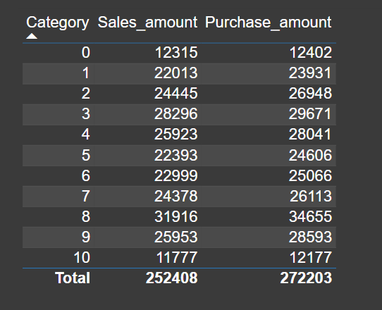
Remember that clear modeling and understanding of your data are crucial. Additionally, the need for a bridge table depends on your data model requirements. Properly addressing “Many to Many” relationships ensures accurate and insightful Power BI reporting.
Question 62: How do I calculate the unique combinations of two columns in Power BI?
Or How to get distinctcount to two columns?
Power BI allows you to calculate distinct combinations of two columns by using the DAX function SUMMARIZE in calculation or by concatenating the two columns into a calculated column and then using distinctcount function in a calculation
Distinct count= countrows(summarize(Sales, 'Item'[Brand],Geography[State]))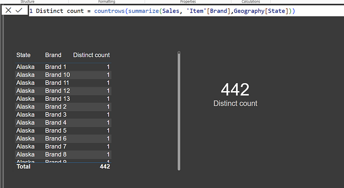
Question 63: I have a visual Brand on the category Axis and net measure on the value axis. I would like to add the city column on the tooltip, but there are multiple cities, how can I show all city values on the tooltip?
You can use a measure that will provide concatenated values. And then you can add that measure on the tooltip option of the visual
Cities = CONCATENATEX(values(Geography[City]), Geography[city], ", ",Geography[City])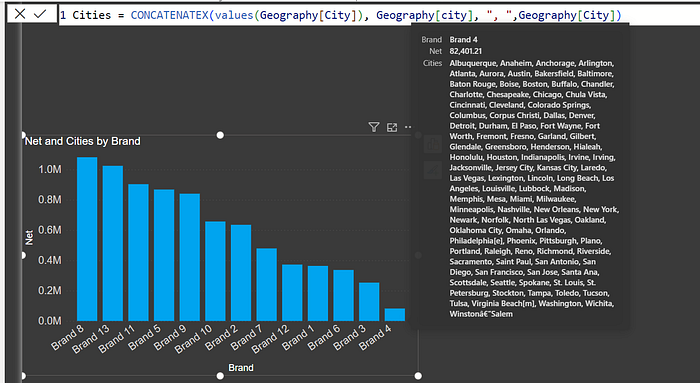
By using this expression, we will be concatenating the distinct values from the ‘city’ column of the ‘Geography’ table, separating them with a comma and a space and sorting them alphabetically.
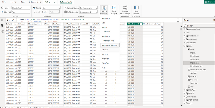
Question 64: How do I sort a column of matrix visual in Power BI using a “Month Year” field in descending order?
I am using a “month year” field on the column of the matrix visual. How can I sort it in descending order?
As of now, there is no built-in option to sort a column in descending order directly within a Matrix visualization in Power BI. However, you can achieve this by creating a calculated column named “Month Year Sort Desc” in your dataset using the Rank function. And mark this as a sort column of “Month year column”. A better approach is to have a new column
Month Year = format ([Date], "MMM-YYYY")
Month Year Sort = format ([Date], "YYYYMM")
Month Year 1= [Month Year]
Month Year sort desc = Rankx(Date, [Month Year Sort],,desc,dense)

//Full Date table Script
Date = var _tab=  ADDCOLUMNS(CALENDAR(date(2019,01,01), date(2022,10,31))
,"Month Year", FORMAT([Date], "MMM-YYYY")
,"Month Year sort", FORMAT([Date], "YYYYMM")
, "Year", YEAR([Date])
,"Qtr Year" ,FORMAT([Date],"YYYY\QQ"),
"WeekDay", FORMAT([Date], "ddd")
,"Month", FORMAT([Date], "MMM")
,"Month sort", FORMAT([Date], "MM")
)
return
ADDCOLUMNS(_tab,
"Month Year 1", [Month Year],
"Month Year sort desc" , Rankx(_tab, [Month Year Sort],,desc,dense))
Using column tools mark the “Month Year Sort Desc” column as the Sort column for the “Month Year 1” column. Use the “Month Year 1” column in the visual. This will sort your Matrix visual column in descending order.
Matrix visual column sorted in descending order.
Question 65: Is there a way to set a date slicer to always show today’s date, or a month slicer to always show the current month in Power BI?
As of October-2023 release
To default a date slicer to today, or a month slicer to the current month in Power BI Desktop, you can create static columns in your data model and use them in the slicer.
To default a date slicer to today:
- Create a new column called “Is Today” and use the following formula:
Is Today = if('Date'[Date] = TODAY(), "Today", [Date] & "")- Add the “Is Today” column to the slicer and select “Today” as the default value.
To default a month slicer to the current month:
- Create a new column called “Month Type” and use the following formula:
Month Type = Switch(True(),
        eomonth([Date], 0) = eomonth(TODAY(), 0), "Current Month",
Format([Date], "MMM-YYYY")- Add the “Month Type” column to the slicer and select “Current Month” as the default value.
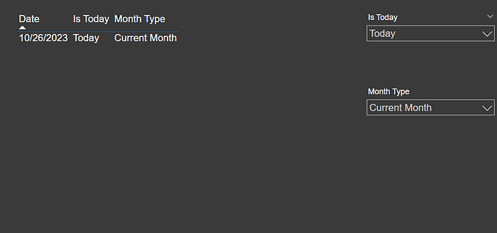
Optional:
You can also create a sort column for these columns to ensure that the values in the slicer are sorted correctly.
Question 66: How can one change the theme in Power BI?
Power BI themes are collections of colors, fonts, and other design elements that can be applied to reports and dashboards in order to create a consistent look and feel. The use of themes can enhance the visual appeal and readability of reports and dashboards.
A number of pre-built themes are available in Power BI, as well as the ability to create your own.
To change the theme in Power BI, follow these steps:
- Open your report in Power BI Desktop.
- Navigate to the View Menu on the top ribbon.
- If you click on the dropdown arrow next to Themes in the Themes section of the View tab, you will see a dropdown menu appear.
- From the available options, select the theme that you would like to use. In addition to the built-in themes, you can also import custom themes if you wish.
- Colors, fonts, and other visual elements of your report will be changed according to the selected theme.
Using the Customize Current Theme option in the Themes dropdown menu, you can create or modify a custom theme. The theme can be customized in various ways, including color, font, and style.
There are also additional themes that have been created by the Power BI community that can be found in the Theme Gallery. To access the gallery, select Theme Gallery from the Themes dropdown menu.
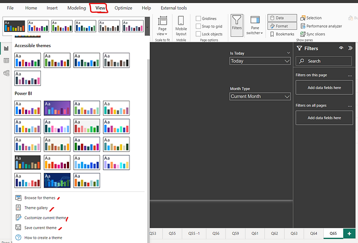
You can also explore external tools for generating themes.
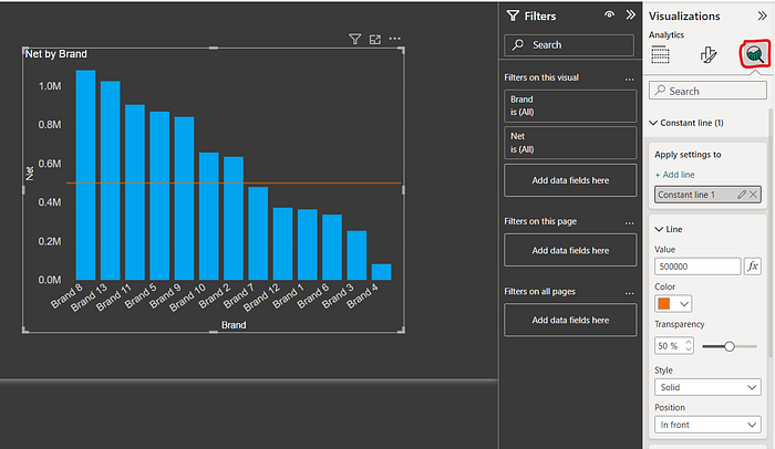
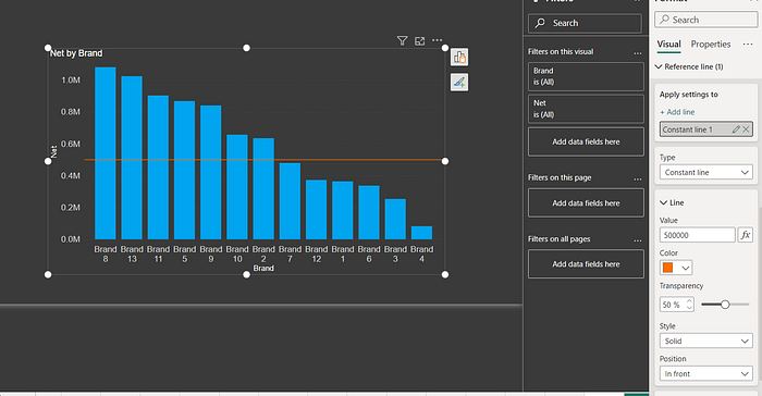
Question 67: How can I add a constant or Average/Constant Line in my visual?
You can add a constant line or Average line both using the constant line option under the analytics pane or under the reference lines section of visual format in case of on-object interaction.
You can also use an Average line from the same section.
To add a constant line to your visual in Power BI, you can follow these steps in case you are not using on-object interaction:
- Select the visual you want to add the constant line.
- In the Visualizations pane on the right-hand side of the screen, click on the Analytics button to expand the options. There you can see different options such as Y-axis constant line, Min line, Max line, Average line, Median line, Percentile line, and Error bars for the visuals in which these lines are feasible.
- Choose a constant line. In the case of a constant line, you can use a value or you can enter a measure using the Fx option. Use an average measure to get an average line.
- Click on Add Line and set value, color, transparency, style, position, and other formatting.
Similarly, to add an average line, you can use the Analytics pane as well.
In case you are using on-object interaction.
- Click on the visual, from the three dots use the format
- Navigate to the Format Pane
- Click on “Visual” and scroll down
- Under Reference Line, Click on “Add Line”
- Choose Line Type- Constant line, Average Line, etc.
- Set value, color, transparency, style, position, and other formatting.
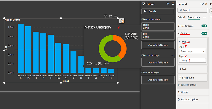
Question 68: What is the Report Tooltip Page?
The tooltip page in a PowerBI report is like a separate page in the report, which appears when a user hovers over a visual. It gives more details about the data in a visual. You can use it to explain data in more depth, share links to other resources, or add interactive charts. Power BI allows you to customize the tooltips that appear when you hover over data points rather than sticking with the default pop-ups.
To create a report tooltip page.
- Create a new page and set the page type to “Tooltip” (if on-object interaction is enabled).
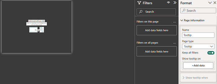
2. Or, turn on “Allow use as a Tooltip” on the page.
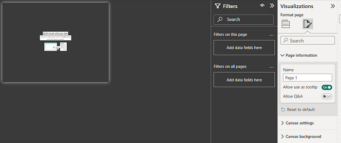
3. Add content to the page.
On the page where you want to use the tooltip, follow these steps:
- Click on the visual and navigate to the Format pane.
- Click on General or Properties(if on-object interaction is enabled).
- Turn on the tooltip.
- Click on Type and choose Report Page.
- Select the page you created as the tooltip.
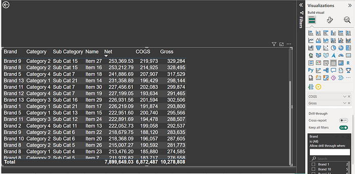
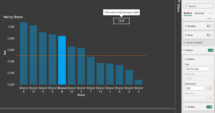
Question 69: What is drill through in Power BI?
How to selectively pass field values to drill through page?
A drill-through feature in Power BI allows users to navigate from one report page to another, focusing on specific details associated with the data. It allows for deeper analysis by providing a way to view detailed information without clogging up the main report.
Drill Through Configuration:
Power BI users can designate certain fields within their dataset as “drill-through” fields. These fields typically contain information that users are interested in exploring further, such as Brand, Category, Item, Customer, or specific dates.
Click on the empty space on the page.
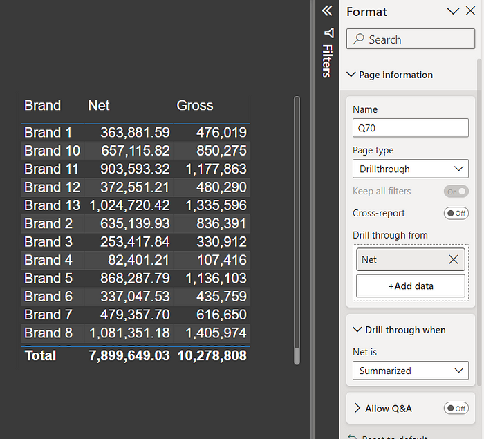
If on-object interaction is enabled. You can add a drill-through field under page information using the page type Drill Through. You have a section “Drill Through From”
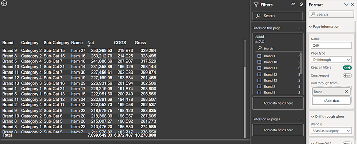
If on-object interaction is not enabled, you have the same information available in the visualization pane. You have a section “Add Drill Through Field Here”
Drill-through passes all filters to the next page, even if they are not added to the “Drill-through” section.
To prevent drilling through from a field, disable the “Keep All Filters” option. This will ensure that only the fields in the “Drill Through” section are passed to the drill-through page.

Accessing Detailed Insights using “Drill Through”:
When you add fields to a drill-through page, the “Drill Through” option will appear on other pages when a user right-clicks on a visual that contains those fields, along with the names of the drill-through pages.

“Drill-through” can also be enabled using a button. When you click on a row, the “Drill-through” button will be enabled. You can then click on the button (Ctrl+Click on Desktop) to navigate to the drill-through page. The button can use a measure to dynamically select the drill-through page.
Question 70: Can I drill through from a card visual?
Yes, drill-through is supported on card visuals. Just add the measure in the drill-through section of the page.
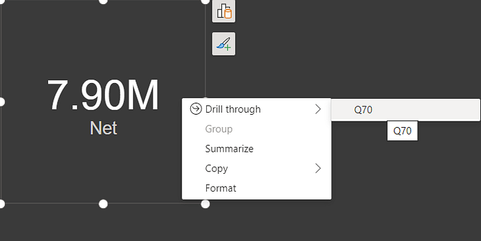
If on-object interaction is enabled. You have a section “Drill Through From”
If on-object interaction is not enabled. You have a section “Add Drill Through Field Here”
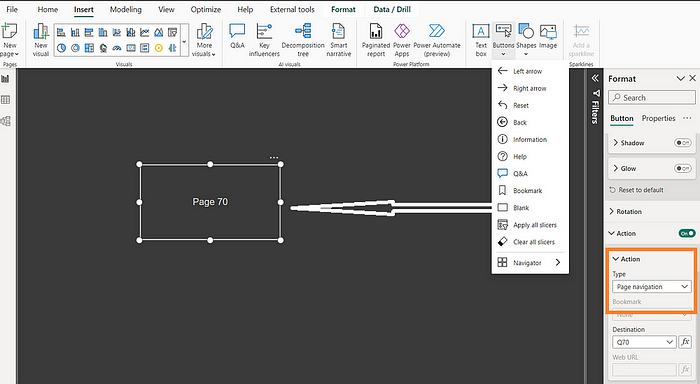
Question 71: How to use the button for Page Navigation?
or How to create a dynamic Page Navigation button?
In Power BI, a “Button” can enhance report navigation.
These buttons enable users to move from one report page to another with a simple click. This makes it easier to explore different aspects of the data or view specific insights without relying solely on the Page Navigation pane.
Users can add a button using the “Insert” option in the top ribbon.
Steps are
- Add a blank button to the “Insert” ribbon option
- Enable the action
- Choose the type as Page Navigation
- Choose a destination page.
To create dynamic page navigation you can use “Measure” in the destination using the “Fx” option
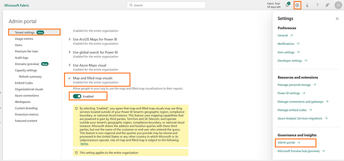
Question 72: Why, I am not able to add Map Visual on the Power BI desktop?
This is because of two settings,
1) Tenant-level setting for Power BI Service
2) Power BI Desktop Security Setting
You will be impacted by the first setting if you have signed in to Power BI Desktop.
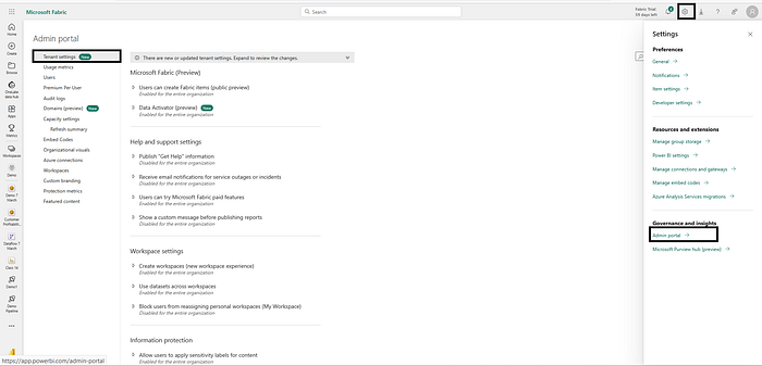
The steps to enable the Service (You need to be a Power BI Admin)
- Click on the Setting icon at the right-top
- Use the Admin Portal Option
- On the Admin portal, choose Tenant settings and scroll down
- Enable “Map and Filled Map visual”
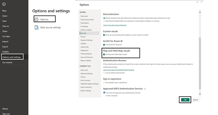
To enable it on Power BI Desktop
- Go to File
- Options and Settings -> Options
- Global -> Security
- Enable: “Use Map and Filled Map Visuals.”
Question 73: Why I am not able to see preview features?
The recent preview features are only available in the latest version of Power BI, so ensure you are using it.
It appears that you have not opted in to preview features. In Power BI, preview features are not enabled by default. Preview features can only be used if you opt-in.
Follow these steps to opt in to preview features:
- Click on the File menu.
- Select Options and Settings.
- Click on Preview features.
- Check the box next to the preview features you want to enable.
- Click OK.
- Power BI Desktop needs to be restarted for some features
- Note: If a Preview feature is Generally Available, it will no longer appear on the list.

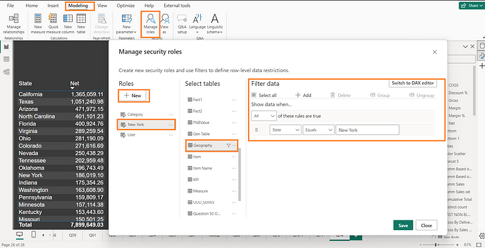
Question 74: What is RLS in Power BI?
The row-level security (RLS) feature in Power BI lets you restrict data access for specific users. Data that is authorized to be viewed is only displayed to authorized users.
In RLS, data is filtered at the row level. Different roles can be defined, and the users will only see the information that is relevant to their role.
In the Power BI service, users with access to a workspace can see all datasets in that workspace. However, RLS only restricts data access for Viewer users. Admins, Members, and Contributors can still see all data in the dataset.
RLS can be configured for data models imported into Power BI with Power BI Desktop. You can also configure RLS on datasets using DirectQuery, such as SQL Server.
To add RLS roles to the desktop, follow these steps:
- Under the Modelling Tab, Select Manage Roles
- Click on the New Role button.
- Enter a role name.
- Create a filter for the data users in the role can see.
- Click on the OK button to save the role.
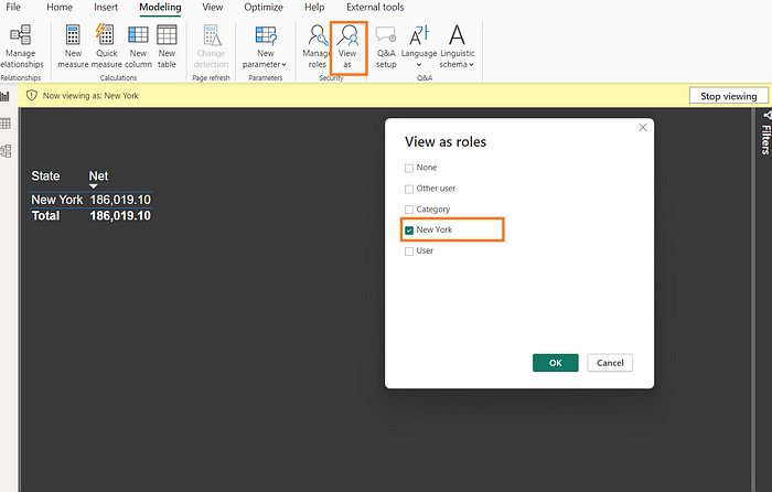
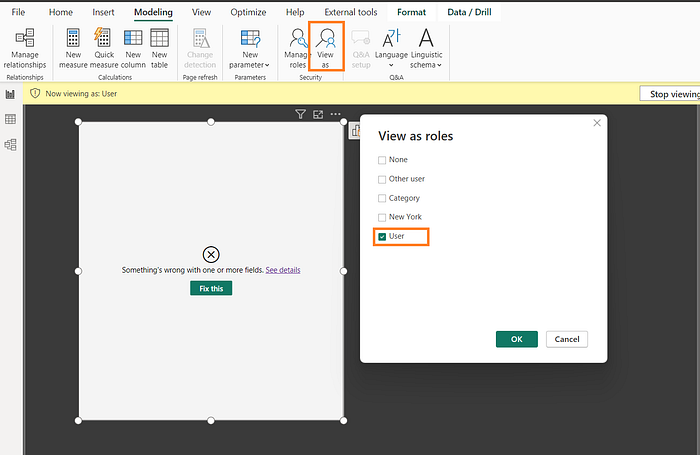
After you have created the role, you can test it on the desktop by clicking “View as” on the modeling tab.
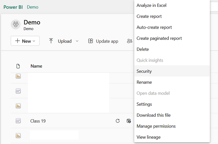
In the Power BI service, you can use the Security option for datasets to assign roles to users.

Users will only be able to view the data that the role allows once they have been assigned a role.
Note: RLS is not supported for live connections to Analysis Services or Azure Analysis Services. For these types of datasets, RLS must be configured in the model.
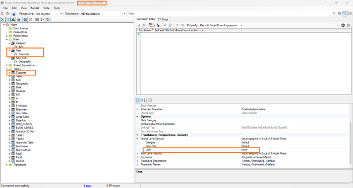
Question 75: What is OLS in Power BI?
Object-level security (OLS) in Power BI is a powerful feature that restricts access to specific tables,and columns from report viewers. This helps protect sensitive data and prevent unauthorized access.
As opposed to RLS, which removes data at the row level, this feature removes the objects from the access.
Power BI Desktop does not natively support OLS, but external tools such as Tabular Editor can be used to implement it.
To add OLS roles to the desktop, follow these steps:
- Create a role in the Power BI
- Navigate to the Tabular editor with the same model
- Open a role
- And set object permission to “None”, to remove from access
- Save and come out
You can test it on the desktop by clicking “View as” on the modeling tab.
In the Power BI service, you can use the Security option for datasets to assign roles to users.
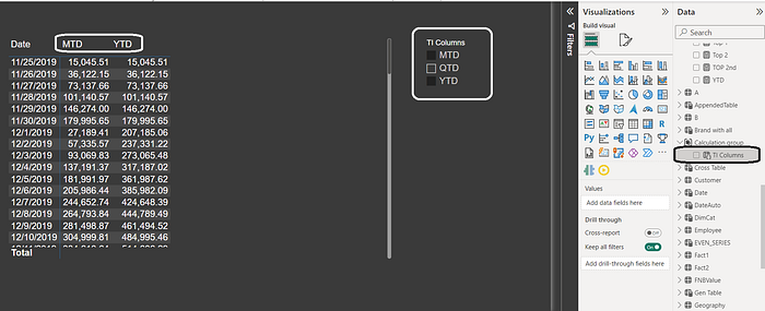
Question 76: What is Calculation Groups?
What are common usages of Calculation Groups?
The Calculation Groups feature in Power BI allows you to group common measure expressions together as calculation items, significantly reducing redundant measures.
Reducing the number of measures you need to create and manage can make your reports more reusable and maintainable.
In reporting clients, calculation groups are displayed as a table with a single column.
A column represents one or more reusable calculations or calculation items that can be applied to any measure already added to the Values filter
The calculation groups work with explicit DAX measures, but not implicit DAX measures.
Calculation groups in Power BI are a feature that allows you to create a collection of measures. To create a calculation group, you need to use the Model pane option under Model view or tabular editor. After installing Tabular Editor, you can open your Power BI model in Tabular Editor and create a new calculation group.
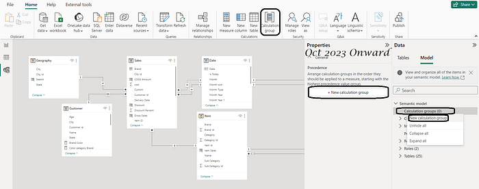
Once you have created a calculation group, you must add one or more calculation items. Each calculation item is a measure based on a formula. To add a calculation item, you need to enter a name for the item and a DAX formula.
MTD = CALCULATE(SELECTEDMEASURE(), DATESMTD('Date'[Date]))
QTD = CALCULATE(SELECTEDMEASURE(), DATESQTD('Date'[Date]))
YTD = CALCULATE(SELECTEDMEASURE(), DATESYTD('Date'[Date]))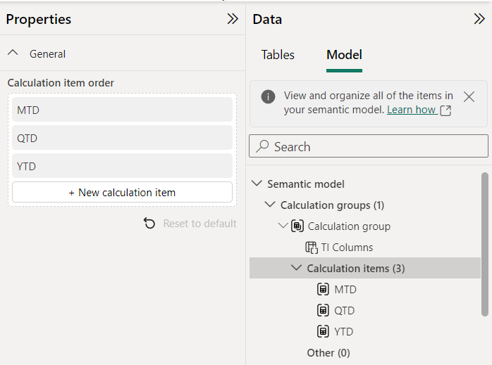

Usages of Calculation Group
Common uses of “calculation groups” are
- Reduced measures, especially for Time Intelligence
- Switching measures, Create a measure Slicer
- Dynamic format strings
- Complex table display
- Measures above column headers
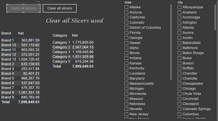
Question 77: What are the usages of “Apply all slicers” and “Clear all Slicers”
The “Apply all slicers” and “Clear all slicers” buttons in Power BI make it easy to apply or clear all slicer selections on a page. Report performance can be improved by doing this.
Using the “Apply all slicers” button will reduce the number of visual queries you send when making selections in multiple slicers. In this case, all slicer selections will only be applied to the other visuals once the button has been clicked.

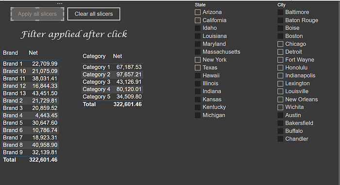
Using the “Clear all slicers” button, you can quickly and easily restore the report to its original state. This can be useful for starting over if you have made a number of selections and want to see the data without filters.
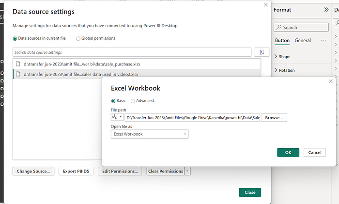
Question 78: How to Modify Power BI Source Connection Details?
Modifying Power BI source details involves adjusting the connection properties or the location of your data source. Here’s a step-by-step guide to help you through the process:
- Navigate to the “File” option located in the menu bar.
- Within the “File” menu, find and select “Options & settings.”
- Under “Options & settings,” you’ll find an essential feature called “Data Source Settings.”
- Clicking on “Data Source Settings” opens a window presenting two key choices: “Data Sources in Current File” and “Global Permissions.”
- Select “Data Sources in Current File” to manage the specific data sources in your current project.
- Within “Data Sources in Current File,” identify and click on the data source that requires modification.
- Once you’ve selected the appropriate data source, click on “Change Source” to alter the file path or connection details.
- Besides changing the source, you can also delete the existing data source if needed.
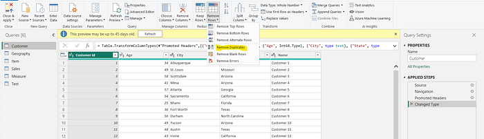
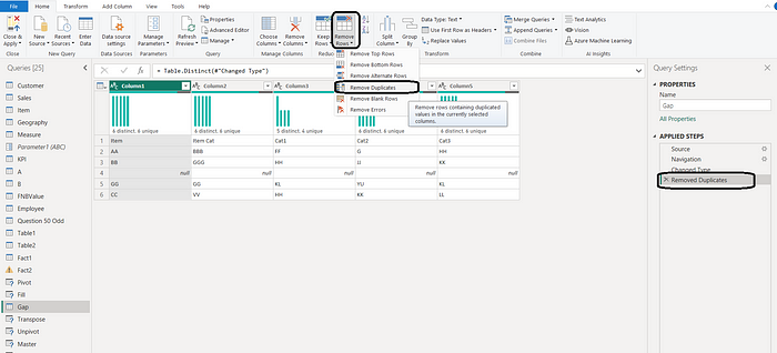
Question 79: How can I delete duplicates in Power BI or Power Query?
In Power Query, you can delete duplicate rows by following these steps:
- Transform Data -> Transform Data can be found under the Home tab of Power BI.
- The Power Query editor will open.
- Select the columns for whom you want to remove duplicates or uncheck all columns to remove duplicates based on all columns.
- Under the Home tab, click Remove rows. You will see a drop-down menu.
- Click on Remove Duplicates to remove duplicate rows from a table or remove duplicates based on the columns selected.
Question 80: How can I append, combine, or union data in Power Query?
To combine and append data in Power Query, you can use the Append Queries feature. This allows you to combine multiple queries into a single query.
Steps:
- Under the home tab, select Transform Data -> Transform Data to open the Power Query Editor
- Select the query you want to append to.
- In the Combine group of the Home tab, click Append Queries. There are two options: “Append Queries” and “Append Queries as New”.
- You can choose “Two Tables” or “Three or More Tables” in the Append Queries dialog box.
- Choose the tables you need
- Click OK.
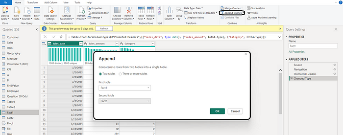
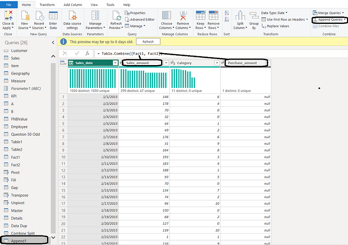
It’s important to note that the Append function in Power Query resembles the Union All operation in SQL. However, unlike Union All, Append allows you to combine tables even if they don’t have the same number of columns.
Question 81: How do I merge two tables in Power Query? What are the various options for merging two tables in Power Query/BI?
To merge two tables in Power Query, the ‘Merge Query’ feature is used.
Steps:
- Under the home tab, select Transform Data -> Transform Data to open the Power Query Editor
- Select the query you want to merge.
- In the Combine group of the Home tab, click Merge Queries. You have two options “Merge Queries” and “Merge Queries as New”
- In the Merge Queries dialog box, select the tables to be merged
- Select the column in both tables to merge. To choose more than one column use Ctrl+ Click
- Select the type of join (Left, Right, inner, full)
- Click OK.
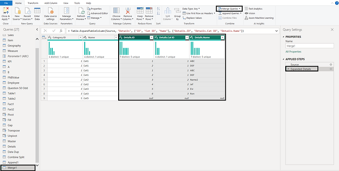
- The second table will be added as a column in the first table.
- Use the expand icon near the column name.
- Select the column you want to add
- Click OK.
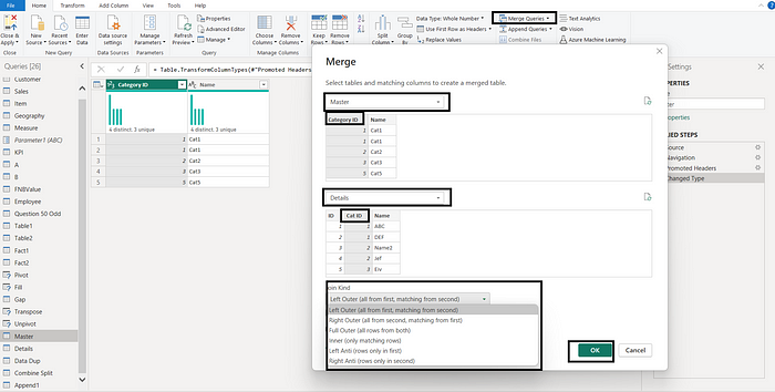
Question 82: Explain Different Types of Joins in Merge Operation.
Power BI merge operations combine data from multiple tables. There are six key merge options, each serving a specific purpose:
(I) Left Outer Join: This join type includes all rows from the first table as well as the matching rows from the second table. If there is no match in the second table, the result will still include the rows from the first table.
II) Right Outer Join: This join includes all the rows from the second table and the matching rows from the first table. If there’s no match in the first table, the output will still contain the rows from the second table.
III) Full Outer Join: Rows from both tables are combined using this join type. It includes all rows from both tables and where there is a match, it combines the data. Even if there is no match between two tables, the result still includes the rows that are unmatched.
IV) Inner Join: In an inner join, only rows with matching values in both tables are included. Unmatched rows are excluded from both tables.
V) Left Anti Join: This join type includes only the rows from the first table that do not match any rows in the second table. From the second table, all matching and unmatched rows are excluded.
VI) Right Anti Join: Those rows from the second table that do not match those in the first table are included in this join. All matching and unmatched rows from the first table are excluded.
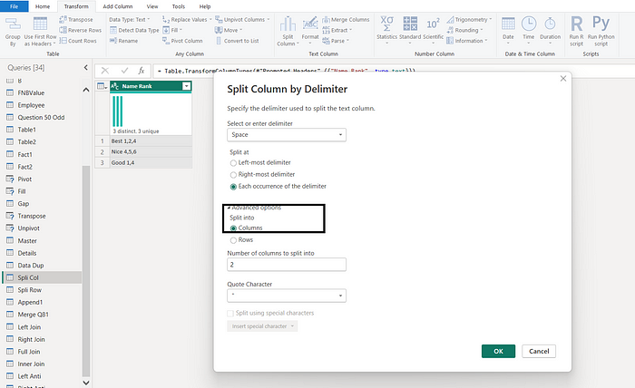
Question 83: How to split text values in a column in multiple rows?
To split text values in a column into multiple rows in Power BI, you can use Power Query transformation. The following are the steps.
- Under the home tab, select Transform Data -> Transform Data to open the Power Query Editor
- Select the column you want to split.
- In the Transform tab, in the Text group, click Split Column.
- In the Split Column Menu, select the most appropriate option
- By the delimiters
- By the Number of characters.
- By Positions
- There are some more options available
- Assume you have selected “By the delimiters “
- In the dialog box, select the delimiter you want to use to split the column.
- Select Split At position
- Under the Advanced option select Rows
- Click OK.
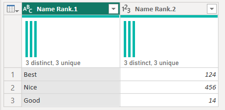
Split By Delimiter into multiple columns
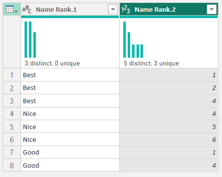
Split By Delimiter into multiple rows

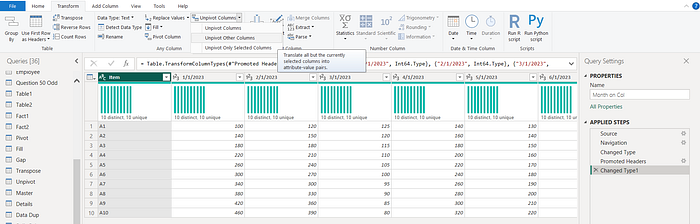
Question 84: What are the best ways to analyze data where months are given as columns in Power BI?
What are the different ways to transform data where months are given as columns in Power BI?
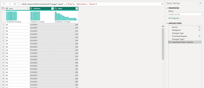
When your data is structured with months as columns instead of rows, it’s commonly referred to as a “wide” format. Analyzing data in this format can be challenging. One way is to use the Unpivot Columns. Using the unpivot feature, you can transform a columnar table into a rowar table. The following are the steps.
- Under the home tab, select Transform Data -> Transform Data to open the Power Query Editor
- Select the table with the data you want to unpivot.
- You can choose the columns you unpivot. But it is better in this case to select the column you do not want to unpivot
- In the Transform tab, in the “Any Column” group, click on the Small Down arrow of “Unpivot Columns”.
- Select Unpivot Other Columns.
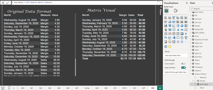
Question 85: How can I transform a Power BI table with columns like Date/city/state, measure, and Value (measure value), where the measure column has values like sales, cost, and margin so that the measure values are in columns instead of rows?
One way to avoid changing table structure is to use the Matrix visual and add Measures as column fields.
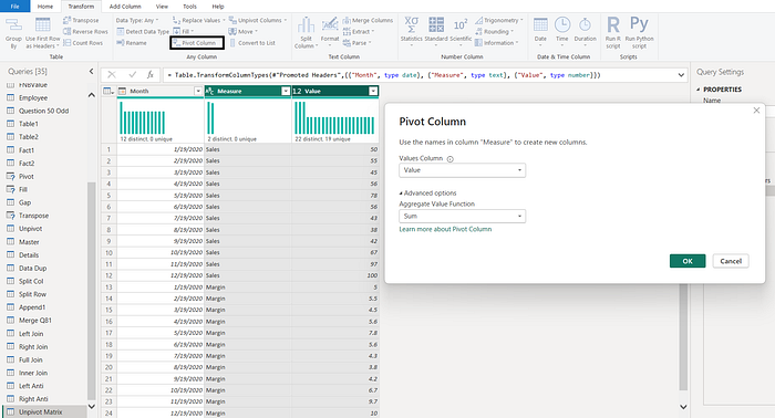
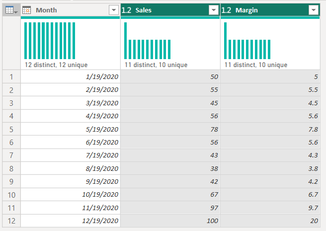
Using the pivot option in Power Query can transform the table structure. The following are the steps.
- Under the home tab, select Transform Data -> Transform Data to open the Power Query Editor
- Inside the Power Query Editor, select the “Measure” column.
- In the “Transform” tab, find and click on the “Pivot Column” option.
- In the Pivot Column window, select “measure value” from the “Values Column” dropdown.
- Choose the aggregation function (such as sum or average) for the pivot operation.
- Click “OK” to apply the pivot transformation.
- After pivoting, your measure values will be displayed as columns. You can rename these columns to more meaningful names if required.
Question 86: How to add a column with a unique row id/number?
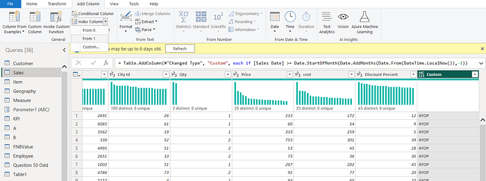
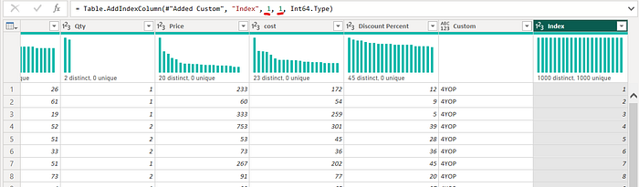
By using the “Index Column” feature in Power BI, you can add a column with a unique row ID.
- Under the home tab, select Transform Data -> Transform Data to open the Power Query Editor
- Choose the table or query that you want to add the unique row ID to in the Power Query Editor.
- On the “Add Column” tab, click “Index Column.” From the dropdown, you can choose from the following options:
- From 0: Using this option, you can generate a unique index starting from zero.
- From 1: Using this option, you can generate a unique index starting from one.
- Custom: Custom starting values can be specified for the index using this option.
4. Custom allows you to choose the starting value as well as the increment value. For other increments, 1 is defaulted. This can be changed in the power query code.
5. Click “Close & Apply” when finished adding the index column to save your changes.
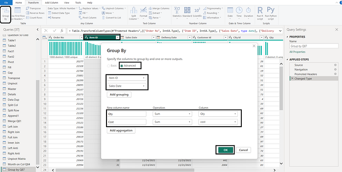
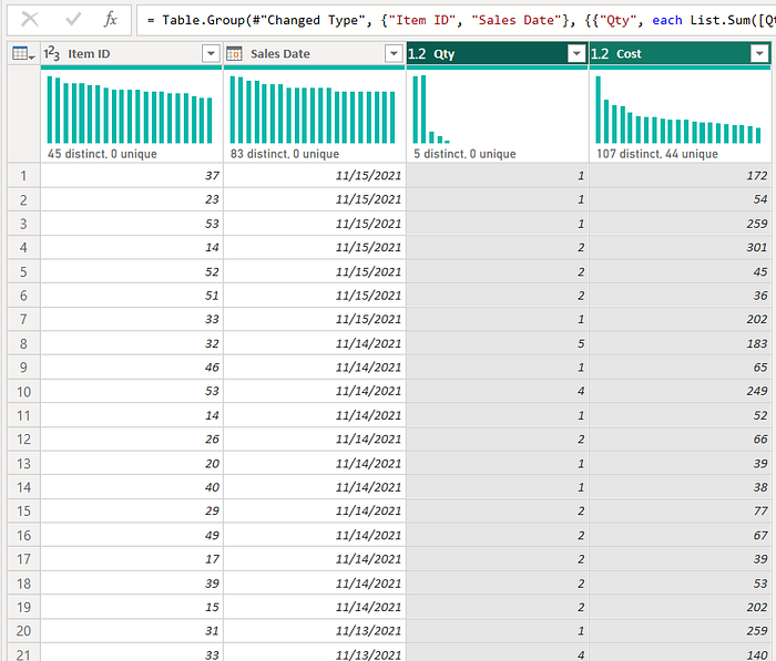
Question 87: What is Group By in Power Query?
How can I create an aggregated table in Power Query?
Power BI’s Group By functionality is a powerful feature that allows users to aggregate and organize data efficiently. Group By in Power Query is a transformation that allows you to summarize your data by grouping it into various categories. This can be useful for a variety of tasks, such as calculating total sales by category, finding the average order value by state, and customer, or identifying the most popular item among your customers.
- Under the home tab, select Transform Data -> Transform Data to open the Power Query Editor
- Inside the Power Query Editor, select the table or query to group by.
- Click the Group By button on the Transform tab.
- Select Basic or Advanced. In advance, you can have more than one grouping and aggregation
- Select a grouping column/s
- Give a name to the new aggregated column. Choose the operation like sum/min/max/count etc and column
- Select All Rows for more complex operations
- Click OK
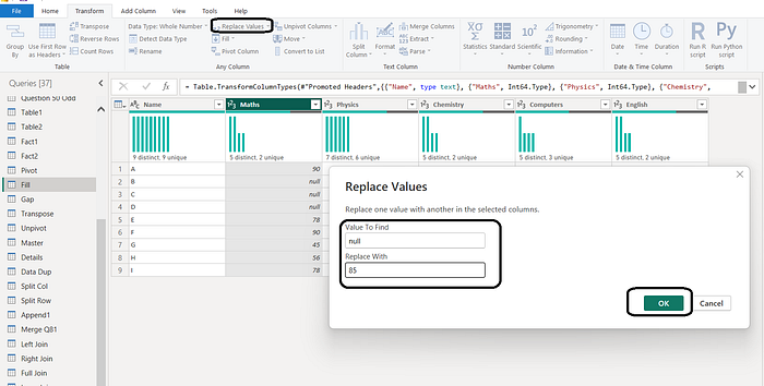
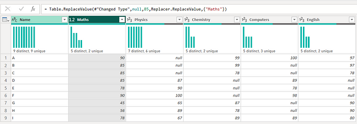
Question 88: How Can I replace a value with a null or null value with a something in power query?
To replace a value with null in Power Query, you can use the Replace Values transformation.
- Under the home tab, select Transform Data -> Transform Data to open the Power Query Editor
- Select the column that contains the value you want to replace.
- Click the Transform tab and click the Replace Values button.
- In the Replace Values dialog box, enter the value you want to find in the Value to Find box. If you want to replace null, add null (all in small caps).
- Enter the replace value in the Replace with box. In case you want to replace with null enter null (all in small caps).
- Click OK to replace the value
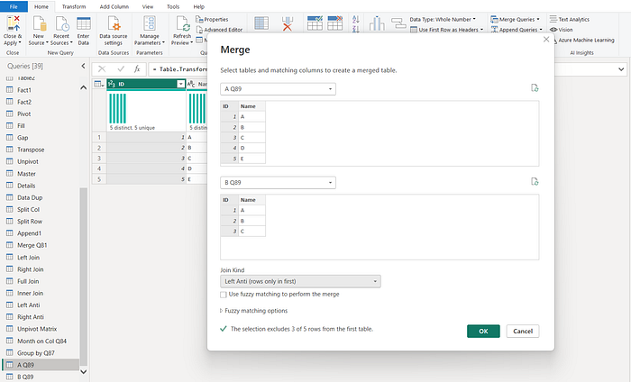
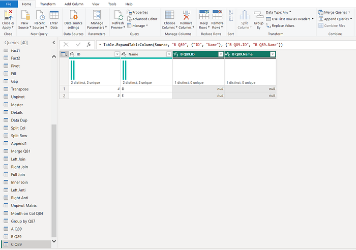
Question 89: You have two tables, A and B, with the same structure. You want to create a third table, C, which contains the values in A that are not in B?
What are the two most common ways to create a table in Power BI that contains the values in Table A that are not in Table B?
Can you explain the difference between the left anti-join and the full outer merge in Power Query, and which one you would use to create a table in Power BI that contains the values in Table A that are not in Table B?
In Power Query, you can achieve this by using the Merge operation with a left anti-join. First, select the primary key column or select all columns by holding Ctrl and clicking in the same order for both tables. Then, perform a left anti-join to obtain the records unique to Table A.
- Under the home tab, select Transform Data -> Transform Data to open the Power Query Editor
- Select Table A.
- In the Combine group of the Home tab, click Merge Queries. You have two options “Merge Queries” and “Merge Queries as New”
- Use “Merge Queries as New”
- In the Merge Queries dialog box, select the second table: Table B
- Select the columns in both tables to merge. To choose more than one column use Ctrl+ Click
- Select the type of join left anti-join
- Click OK.
- Rename the new Table/Query as C
In DAX, you can create the desired table using the EXCEPT function. The EXCEPT function in Power BI returns the rows from the first table in the expression that do not appear in the second table.
- Select any table A or B
- On Table Tools, click on “New Table”
- Use following DAX: C= EXCEPT(A,B)

Question 90: How can you use Power Query to get the column distribution/Quality/Profile for a column of data?
In Power Query, you can get the column distribution/Quality/Profile by following these steps:
- Under the home tab, select Transform Data -> Transform Data to open the Power Query Editor
- Choose the column for which you want to see the distribution.
- On the View tab, click the Column Distribution/Quality/Profile checkbox.
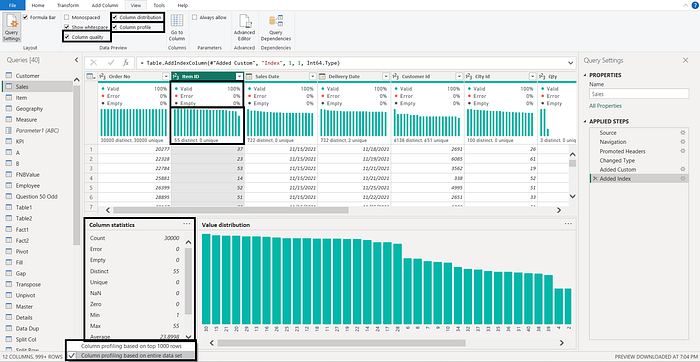
Question 91: What is the difference between distinct and unique values in Power Query’s column distribution?
In Power Query’s column distribution, the difference between distinct and unique is as follows:
- Distinct: The number of distinct values in the column, regardless of their frequency.
- Unique: This refers to the count of unique values that appear only once in a given column.

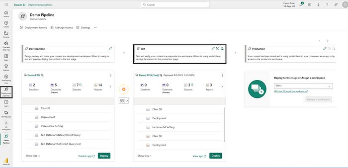
Question 92: What is the Deployment Pipeline in Power BI?
Power BI Deployment Pipeline allows you to move reports and datasets between different environments (such as development, testing, and production). Comparison and deployment of content are possible. Deployment Pipelines are a Premium feature in Power BI, offering a structured and automated way to handle environment-specific changes and ensuring data consistency and reliability.
To create a deployment pipeline in Power BI, you need a PPU/Premium Capacity license. Once you have a PPU/Premium Capacity license, follow these steps:
- Go to the Power BI Service.
- In the left pane, click Deployment Pipelines.
- Click Create a Pipeline.
- In the Create a Deployment pipeline dialog box, enter a name and description for the pipeline.
- In the Customize stage, add the stages you want.
- Once the pipeline is created, assign the workspaces to each stage.
- Now you can check and migrate content from one workspace to another in the pipeline.
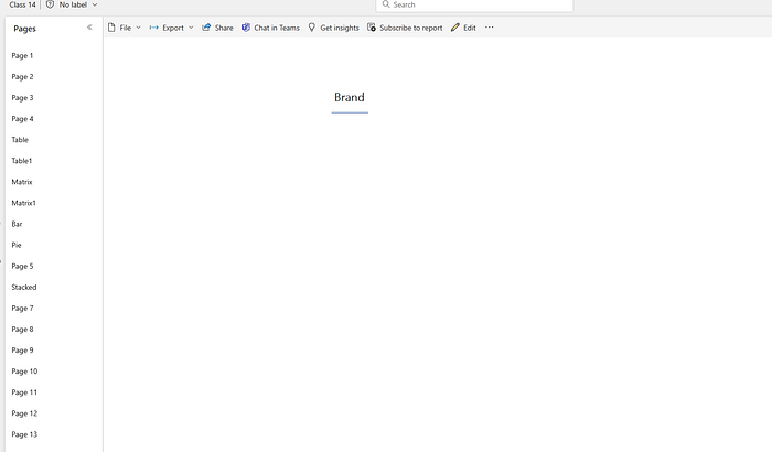
Question 93: I have moved my dataset file from the Development workspace to the Test workspace for the very first time. Assuming I have two years of data in the Development workspace, how much data will be there in the Test workspace for the first time before refresh?
When you move a dataset file from the Development workspace to the Test workspace, the only metadata will be copied to the Test workspace. This means that the Test workspace will have no data before first refresh.
Data is not copied from the source workspace to the target workspace when using a deployment pipeline. All deployments are metadata-only, so a data refresh is required after deploying to a target workspace. For first-time deployments, you must also configure the data source credentials or gateway connectivity (as appropriate).

File after the first deployment. No Data
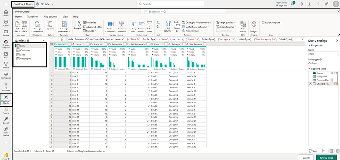
Question 94: What is Power BI Dataflows?
Power BI dataflows are curated collections of tables within the Power BI service, organized and managed in workspaces. They empower users to seamlessly integrate and transform data from diverse sources, creating standardized and reusable data models. These models, containing transformed data, can be stored in Azure Data Lake Gen 2 storage. Power BI dataflows enhance data security, minimize redundancy, and provide an efficient solution for handling large datasets within the Power BI ecosystem.
In Power BI Desktop, data transformation is facilitated through Power Query. Power Query features are extended to Power BI dataflows in the Power BI service, allowing centralized data transformation and creating a layer of abstraction. Dataflows provide a unified platform where users can apply Power Query transformations, ensuring consistent data processing across reports and datasets. This centralized approach enhances efficiency and maintains data consistency within the Power BI environment.
Question 95: What is the Power BI service dashboard?
A Power BI dashboard is a single page that uses visualizations to tell a story. It is essentially a canvas that contains tiles, which are visualizations pinned to the dashboard by report designers. Dashboards are limited to one page and contain only the most important elements of the story. Readers can view related reports for more details.
Most of the time, Users consider the Power BI report or Report page as a dashboard. In the case of Power BI, a Dashboard can only be created on the Power BI service and it can have data from multiple reports.
Dashboards are a feature of the Power BI service and are not available on the Power BI Desktop. You can create a dashboard by adding custom visualizations to it, which highlight the most important aspects of your data.
Question 96: What do mean by Tenant Setting in Power BI Service?
Tenant settings refer to the configurations and policies that administrators can apply at the organizational level within Power BI By configuring these settings, administrators can control how Power BI functions for users within their organization. Tenant settings are crucial for ensuring security, compliance, and efficient usage of Power BI across an organization.
Tenant settings can be found under Power BI Service -> Settings -> Admin Portal -> Tenant Settings
Tenant settings typically cover the following areas:
Help and support settings
Workspace settings
Export and sharing settings
Discovery settings
Content pack and app settings
Integration settings
Power BI visuals
R and Python visuals settings
Audit and usage settings
Dashboard settings
Developer settings
Admin API settings
Gen1 dataflow settings
Template app settings
Q&A settings
Dataset Security
Advanced networking
Metrics settings
User experience experiments
Share data with your Microsoft 365 services
Insights settings
Datamart settings
Data model settings
Quick measure suggestions
Scale-out settings
OneLake settings
Git integration
Question 97: What are Power BI workspaces and workspace roles?
Power BI workspaces are shared containers for content, such as reports, dashboards, datasets, and paginated reports. They allow users to collaborate on and share content with other users in their organization.
Workspace roles control who has access to workspaces and what they can do within those workspaces. There are four workspace roles:
- Admin: Admins have full control over the workspace, including the ability to add and remove users, manage permissions, and publish content.
- Member: Workspace members can create, view, and edit content. However, they cannot create or delete workspaces or add or remove administrators
- Contributor: In the workspace, contributors can create content and edit it, but they cannot publish apps or manage dataset permissions. In the workspace, Contributor can create, edit, and delete content, such as reports, and publish reports to the workspace.
- Viewer: A viewer can only view content in a workspace.

Question 98: What is a Power BI on-premises data gateway?
A Power BI on-premises data gateway is a software bridge that securely connects your on-premises data sources to Power BI and other Microsoft cloud services, such as PowerApps, Power Automate, Azure Analysis Services, and Azure Logic Apps. Organizations can thus keep their databases and other data sources on-premises but still use that data securely in the cloud.
The on-premises data gateway acts as a middleman between your on-premises data sources and Power BI. The gateway retrieves data from your on-premises data sources and sends it to the Power BI cloud service when you refresh a Power BI dataset or report. In addition to encrypting data in transit, the gateway also protects it from unauthorized access.
Types of on-premise data gateways
There are three types of on-premise data gateway:
- On-premises data gateway: This type of gateway is designed for use by multiple users and can connect to a variety of on-premises data sources. It is well-suited to complex scenarios where multiple people need to access multiple data sources.
- On-premises data gateway (personal mode): This type of gateway is designed for use by a single user and can connect to multiple on-premises data sources. It is well-suited to scenarios where you are the only person creating reports and do not need to share data sources with others.
- Virtual network data gateway: This type of gateway is a managed service that allows many users to connect to multiple data sources secured by virtual networks. It is well-suited to complex scenarios where several people need to access multiple data sources secured by virtual networks.
Question 99: What is incremental load in Power BI and what are the benefits of using it?
Incremental load in Power BI is a process of refreshing a dataset by only loading new or updated data, instead of refreshing the entire dataset.
Incremental refresh for datasets can improve performance and reduce resource consumption for Power BI datasets with frequently changing data. Incremental refresh in Power BI goes beyond regularly scheduled refresh tasks. It introduces automated partitioning and management for dataset tables dealing with constantly evolving data.
Supported data sources: Incremental refresh and real-time data works best for structured, relational data sources, but can also work for other data sources. Your data source must support date filtering.
Incremental refresh partitions the Power BI service table and loads only the latest data into the model. The service creates incremental refresh and historical partitions, and optionally a real-time DirectQuery partition based on the incremental refresh policy settings.
Benefits:
- Faster refreshes
- More reliable refreshments.
- Reduced resource consumption
- Ability to handle large datasets
Configuration: Incremental refresh is configured in Power BI Desktop. The following steps are involved:
- Create two Power Query date/time parameters with the reserved, case-sensitive names RangeStart and RangeEnd.
- Apply custom date filters to your table’s date column using the following parameters.
- Define an incremental refresh policy for the table.
- Archive Data Starting: In Days/Months/Quarters/Years
- Incremental Refresh Starting: In Days/Months/Quarters/Years
- Other optional settings
Once the model is published to the Power BI service, the policy is used by the service to create and manage table partitions. It is also used to perform refresh operations.
Question 100: What Power BI features could be improved?
Note: This question assesses your in-depth knowledge of Power BI. I’ll outline a few features that need improvement as of the last Power BI update. Please note that these limitations may change coming months, so always stay updated with the latest features. One such example is the calculation group, which required an external tool when I started this blog a few weeks back. However, that limitation was removed in October 2023.
Here are a few Power BI features that could be improved:
Visualization:
- Sequence number in table and matrix visual
- Conditional formatting on matrix columns and rows
- Conditional formatting with multiple measures and legend
- Support of conditional formatting line
- Custom multiple columns sort on matrix visual
- Support of legend on the secondary y-axis
Data analysis:
- Support for the year-end date in quarter and month function to support financial period calculation starting from any date
- Standard time intelligence function for a week
- Complex visual support like visuals that combine table and matrix support
Usability:
- Selection of slicer values with a search like Excel
- Multi-column search slicer across the table
- Measure to sum the values from the row level
- SAP and Oracle drivers need improvement
- Better tooltip control when the tooltip page is not used
- Support for large data loading in batches based on various fields of the table
I have tried to be specific in my answers and have avoided generic answers. I have also mentioned that these are just a few examples and that the list of features that could be improved is constantly changing.
In addition to the above, I would also add that Power BI’s mobile app could be improved by adding more features and functionality. For example, it would be great to be able to create and edit reports and dashboards on the mobile app.
Overall, Power BI is a great business intelligence tool, but there are still some areas where it could be improved. Microsoft is actively developing Power BI, so I am confident that we will see many improvements in the future.
Question 101: What is Microsoft Fabric?
The Microsoft Fabric is an integrated Platform that provides customers with a SaaS-ified, open, lake-centric, full-featured data, analytics, and AI platform that meets all of their data analytics needs.
Microsoft Fabric is a revolutionary data analytics platform that eliminates unnecessary data replication and enables seamless integration with various Microsoft tools. This unified approach empowers organizations to work with a true single source of data, streamlining their workflows and maximizing their data assets.
- Eliminates data duplication and silos: Microsoft Fabric stores all data in a central lake in a standardized format, eliminating the need to replicate data across multiple systems. This simplifies data management and ensures that everyone is working from the same source of truth.
- Enables seamless integration with Microsoft tools: Microsoft Fabric is deeply integrated with various Microsoft tools, including Power BI, Azure Machine Learning, Azure Synapse Data Warehouse, Azure Data Pipelines, etc. This makes it easy to share data and insights between different applications, streamlining workflows and enhancing productivity.
- Provides a single source of truth: Microsoft Fabric provides a single source of truth for all data, regardless of its source or format. This makes it easy to get a holistic view of your data and identify trends and patterns that would otherwise be difficult to see.
- Empowers diverse users: Microsoft Fabric is designed for users of all skill levels, from data scientists to business analysts. It provides a variety of tools and features to help users get the most out of their data, regardless of their expertise.
Microsoft Fabric is a powerful data analytics platform that can help organizations of all sizes make better decisions and achieve their goals.
You can read more about Microsoft Fabric, on my blog
You can learn more from my YouTube series.
Mastering Microsoft Fabric: 35+ Videos
Mastering Microsoft Fabric in Hindi
Conclusion
In this blog post, we cover a variety of Power BI interview questions, including both basic and advanced questions. We have also provided detailed answers to each question, including helpful tips and resources.
If you are preparing for a Power BI interview, I encourage you to review the questions and answers in this blog post and the previous one. Also, watch the suggested videos and series.
In addition to the above, I would like to add that Power BI is a rapidly evolving tool. New features and capabilities are added constantly. As such, it is imperative to stay up-to-date on Power BI developments. You can do this by reading the Power BI blog(blog.powerbi.com), following Power BI experts on social media, and attending Power BI events.
You should also be prepared to discuss your experience with Power BI in the context of your previous roles and projects. Be able to articulate the specific ways you have used Power BI to solve business problems and deliver value to your organization.
Finally, remember that the interviewer is also trying to get to know you as a person. Be yourself and let your personality shine through. Best of luck in your Power BI interviews! Remember, preparation, enthusiasm, and authenticity are your best allies.
Important Links- Content, Blogs, Influencers etc
Complete Power BI in one Video in 11 hours
Mastering Power BI: 230+ Videos
Expertise Power BI: 150+ Videos
सीखे Power BI हिंदी मे: 60 Videos
My Medium blogs can be found here if you are interested
Click here to access all my blogs and videos in a jiffy via an exclusive glossary using Power BI. Please like, share, and comment on these blogs. I would appreciate your suggestions for improvement, challenges, and suggestions for topics so that I can explore these in more depth.
In addition, I have over 750 videos on my YouTube channel that are related to Power BI, Tableau, and Incorta. With the help of these videos, you will learn hundreds of DAX and Power Query functions, in addition to hundreds of Power BI, use cases that will assist you in becoming an expert in Power BI. Make sure you subscribe, like, and share it with your friends.
Master Power BI
Expertise in Power BI
Power BI For Tableau User
DAX for SQL Users
Learn SQL
Don’t forget to subscribe to
and join our Power BI community

